-
Improvement
-
Resolution: Done
-
 High
High
-
None
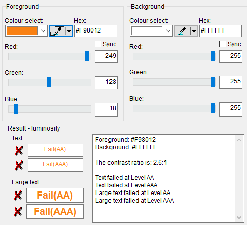
The colour contrast ratio of orange headings (#F98012) displayed on moodle.org fails to meet the minimum recommended colour contrast requirements as described in WCAG 2.1 Success Criterion 1.4.3: Contrast (Minimum) making it difficult for some visitors to read the headings. This is an accessibility issue.

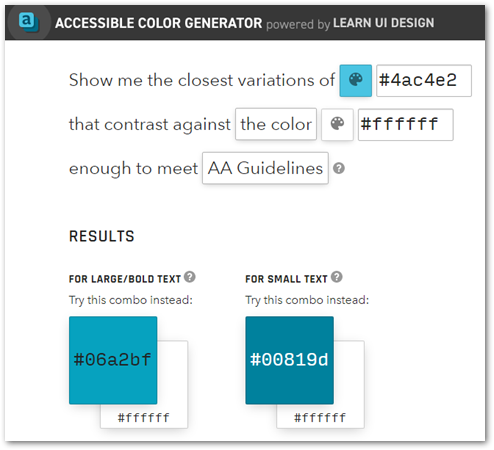
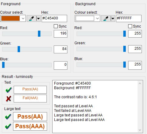
I realize that it is not quite the "Moodle" orange but perhaps changing the colour of headings to a colour like #E26D00 would meet the guidelines for large text such as a heading.
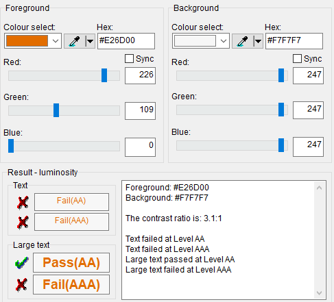
The second test shown above is because sometimes the heading is on a slightly grey background and I wanted to find a value that worked for both this and white.
However, I noticed that the headings in the blocks are considered small text, even though they are in all caps. These might need to be #C45400.

For more information, see:
https://www.w3.org/WAI/WCAG21/Understanding/contrast-minimum.html

- has a non-specific relationship to
-
MDLSITE-6659 Update to current Moodle.org main page to promote Moodle 4 release
-
- Resolved
-
- has been marked as being related by
-
-

- Resolved
-