-
Bug
-
Resolution: Duplicate
-
 Minor
Minor
-
None
-
4.5.5, 5.0
-
None
-
MOODLE_405_STABLE, MOODLE_500_STABLE
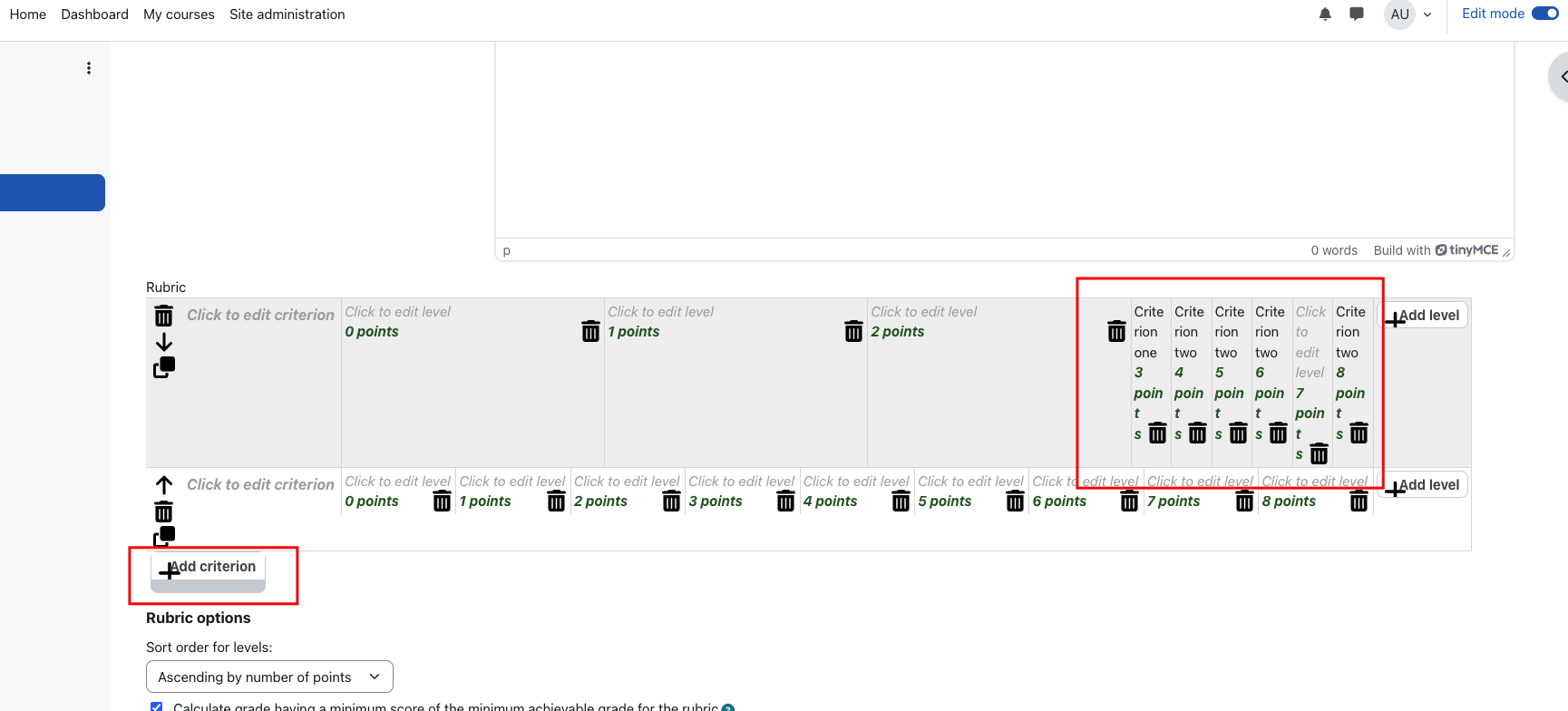
When defining a rubric, the rubric table looks wrong, which affects the user experience because the levels cannot be easily defined. Additionally, the add criteria button looks bad. I add a reference image.
Thanks in advance for checking this!
- duplicates
-
-
- Waiting for integration review
-