Uploaded image for project: 'Moodle app'
  1. Moodle app
  2. MOBILE-339

The Menu and any panel that goes to the left should be 320px

XMLWordPrintable

    • MOODLE_12_STABLE
    • MOODLE_13_STABLE

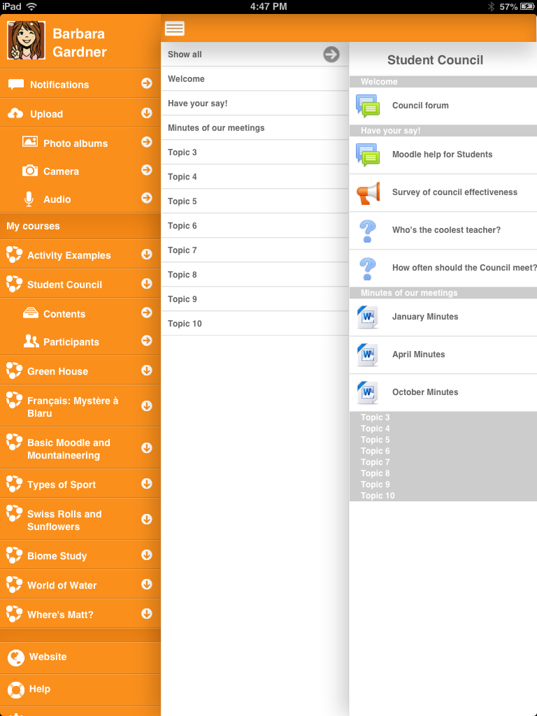
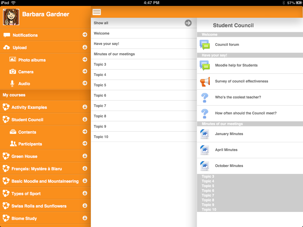
      When you switch from lanscape to portrait you can notice that the menu is reduced thus we can see everything in one page. However I think it would be better to follow what's mot apps does which it to have a consistency in the menu width. It is ok if we don't see the third panel, people need to use the menu option to retract the menu and see the third panel. This would make the menu looks good in anytime and not have a shrinking version in portrait mode.

        1. IMG_0016.PNG
          IMG_0016.PNG
          150 kB
        2. IMG_0017.PNG
          IMG_0017.PNG
          124 kB
        3. IMG_0018-2.png
          IMG_0018-2.png
          258 kB
        4. IMG_0019-2.png
          IMG_0019-2.png
          201 kB

            jleyva Juan Leyva
            jerome Jérôme Mouneyrac
            Votes:
            0 Vote for this issue
            Watchers:
            1 Start watching this issue

              Created:
              Updated:
              Resolved:

                Error rendering 'clockify-timesheets-time-tracking-reports:timer-sidebar'. Please contact your Jira administrators.