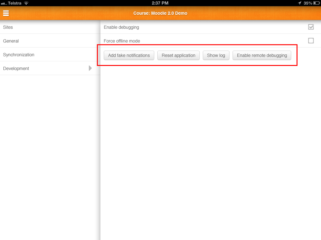
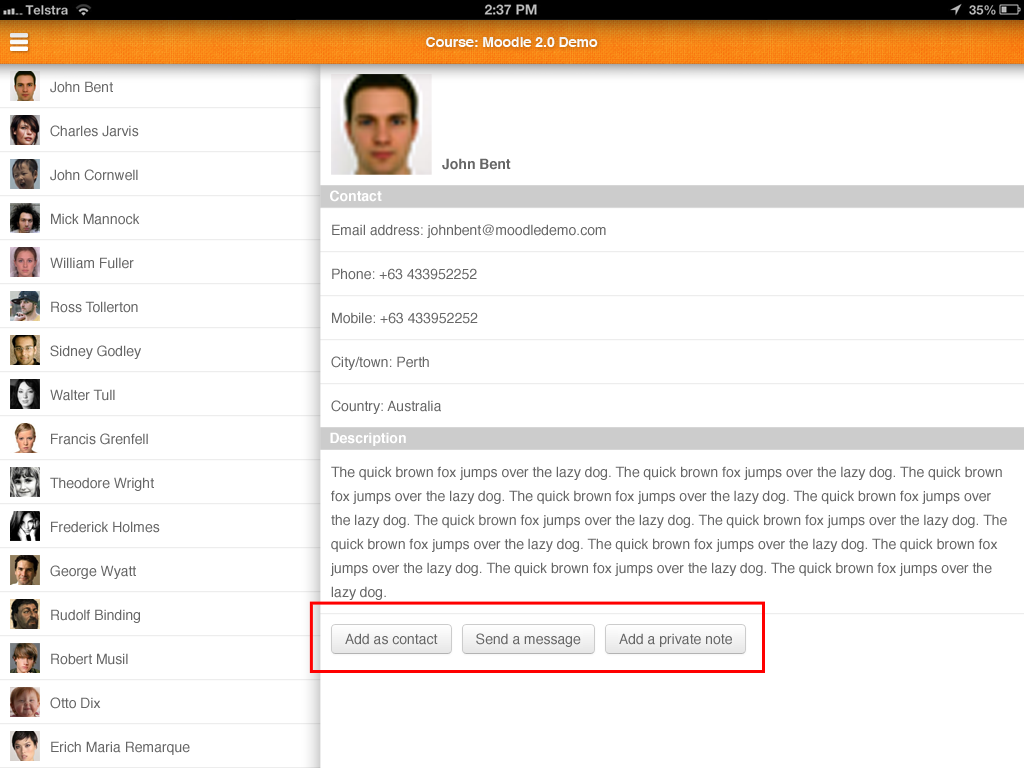
The buttons like the 'upload' button on the photo upload is too thin. The iOS human interface guidelines suggest "44 x 44 points is the comfortable minimum size of a tappable UI element." http://developer.apple.com/library/ios/#documentation/userexperience/conceptual/mobilehig/Characteristics/Characteristics.html
I completely agree, and its noticeable to me because these things are hard to tap.
e.g. rows on the setting screen and course screen, the 'close button' on popups, the upload image butotn
- blocks
-
MOBILE-323 Create HTML/CSS template of the button
-

- Resolved
-
-
MOBILE-288 Implement new button design
-
- Resolved
-
- has a non-specific relationship to
-
-
- Resolved
-
- will be (partly) resolved by
-
MOBILE-386 Enhance participants submenu panel and content panel
-
- Resolved
-
-
-
- Resolved
-