Description updated by jerome
Some ideas:
- make normal row (like content page)
- use the grey delete Moodle svg icon instead of the big one (I don't think we need explanation for it, the icon should be pretty clear, however there should be a confirmation dialogue)
- use the grey tick Moodle svg icon instead of asterix
Try also with the color version if it looks better. Also add some more space between the button and the site. Also one good thing would be to have an image of the user when you are connected with different user for the same site (super rare it's true).
Previously was created by Andrew:
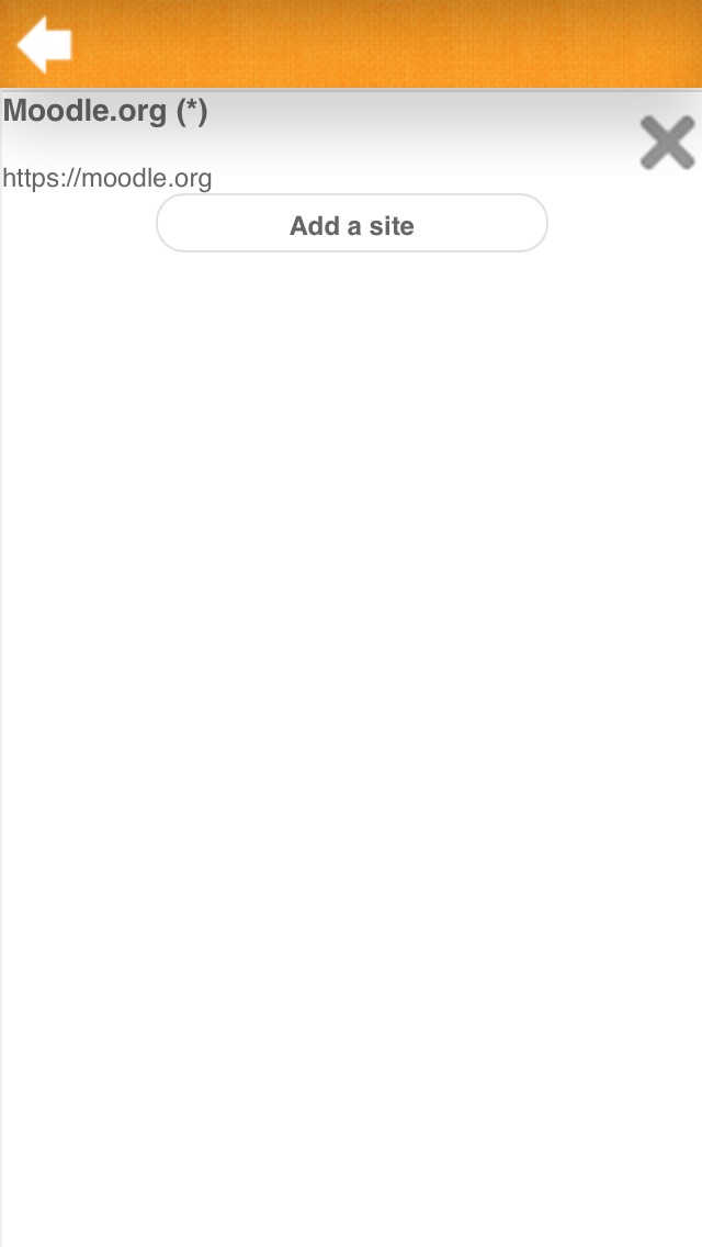
Viewing the Settings -> Sites screen lacks style and information
The Settings -> Sites screen has the site name with asterisk after it, what's the asterisk for?
The page lacks theming, and doesn't explain what the big X is for beside the site name (presumably delete).
- blocks
-
MOBILE-321 Create HTML/CSS template of the site settings page
-

- Resolved
-
-
MOBILE-275 Implement new site settings page design
-
- Resolved
-
- will be (partly) resolved by
-
MOBILE-387 Enhance settings submenu panel and content panel
-
- Resolved
-