Uploaded image for project: 'Moodle app'
  1. Moodle app
  2. MOBILE-269

Design the popup dialogue

XMLWordPrintable

    • Icon: Improvement Improvement
    • Resolution: Fixed
    • Icon: Minor Minor
    • 1.3
    • 1.2
    • iOS
    • MOODLE_12_STABLE
    • MOODLE_13_STABLE

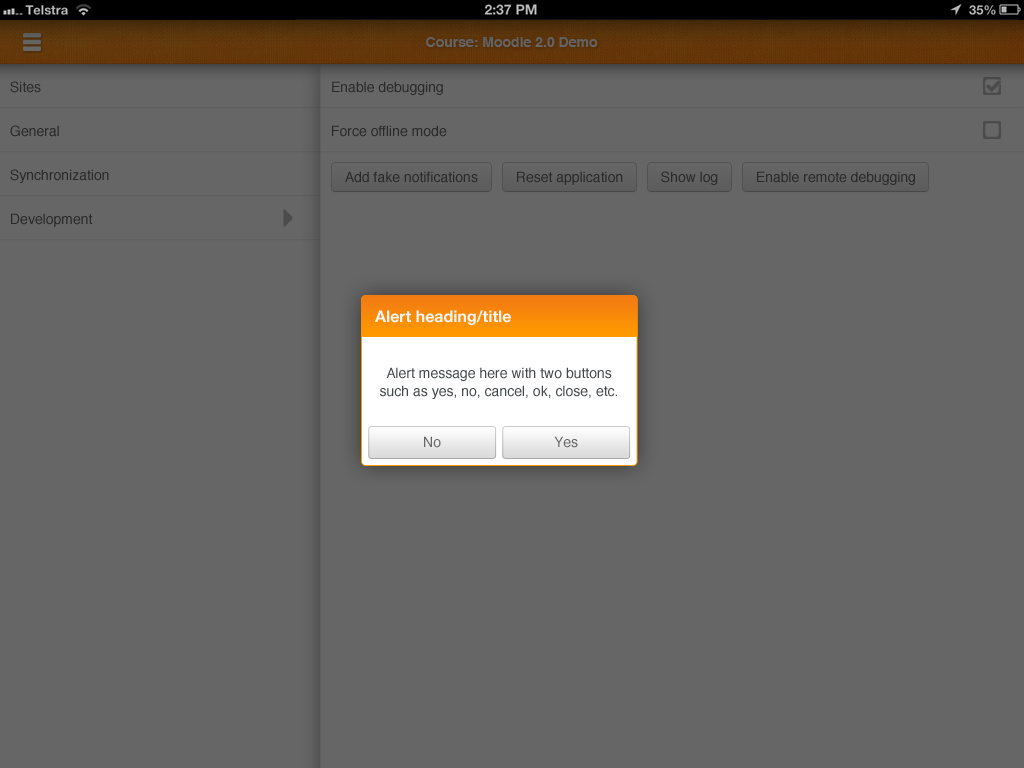
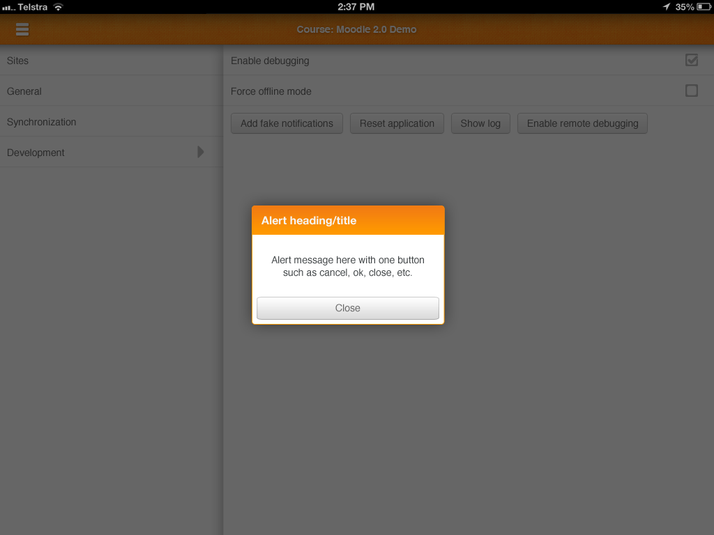
      Create mockups for all popup dialogue (error / information / confirmation).
      Also do we want animation when the popup close? Which one (example)?
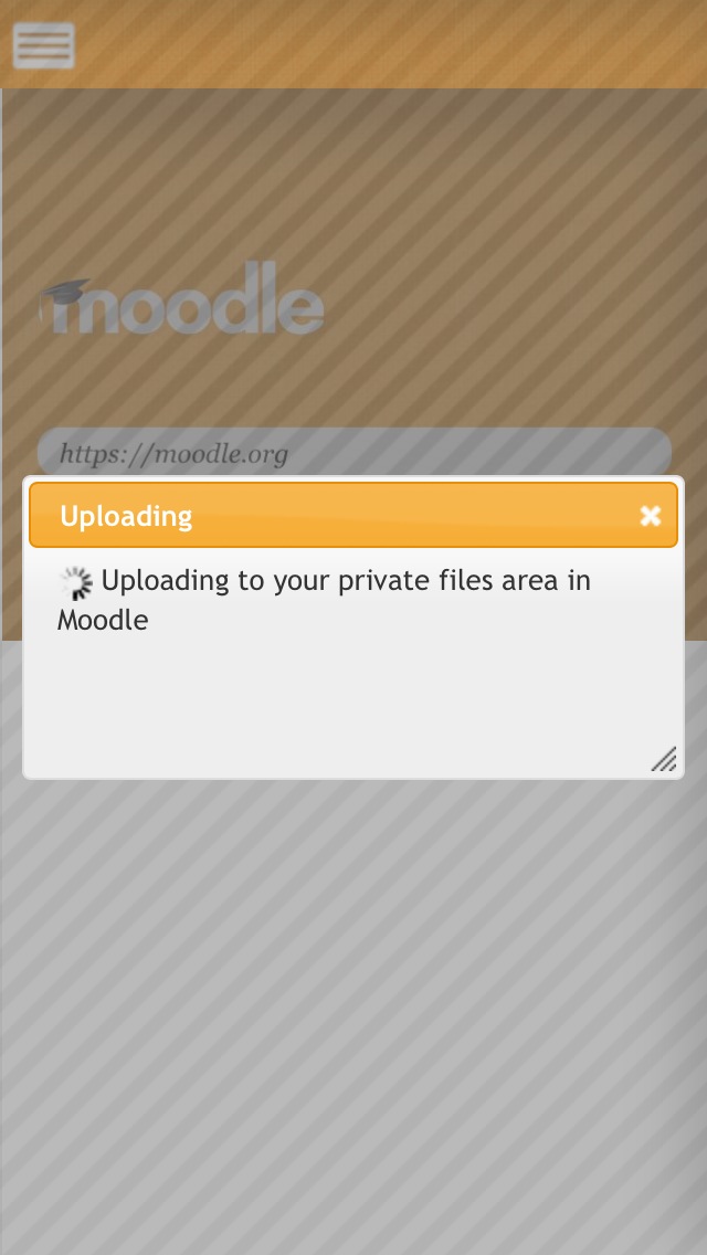
      If in the same time you can create a mockup with the loading icons. (like the upload)

      Previously it was:

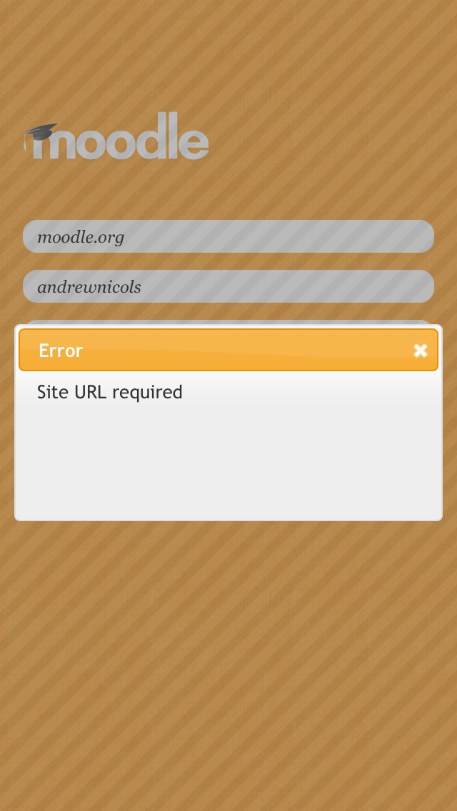
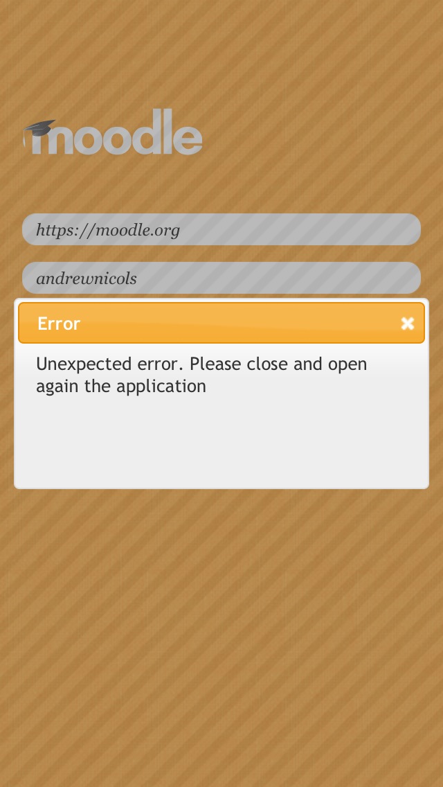
      Messages should appear centered

      I think that the error and informational messages should probably appear centered within the dialogue.

      It may also be prudent to move the spinner to the end of the text rather than have it at the beginning, or to have it at the end of the title, or on a new line beneath the message.

        1. popup-dialogue-2.png
          popup-dialogue-2.png
          72 kB
        2. popup-dialogue-1.png
          popup-dialogue-1.png
          72 kB
        3. IMG_1070.jpg
          IMG_1070.jpg
          30 kB
        4. IMG_0006.jpg
          IMG_0006.jpg
          86 kB
        5. IMG_0003.jpg
          IMG_0003.jpg
          101 kB
        6. IMG_0002.jpg
          IMG_0002.jpg
          108 kB

            barbararamiro Barbara Ramiro
            dobedobedoh Andrew Lyons
            Votes:
            0 Vote for this issue
            Watchers:
            4 Start watching this issue

              Created:
              Updated:
              Resolved:

                Error rendering 'clockify-timesheets-time-tracking-reports:timer-sidebar'. Please contact your Jira administrators.