-
Improvement
-
Resolution: Fixed
-
 Minor
Minor
-
1.2
-
MOODLE_12_STABLE
-
MOODLE_13_STABLE
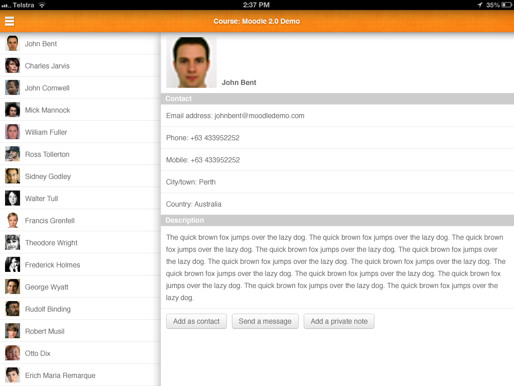
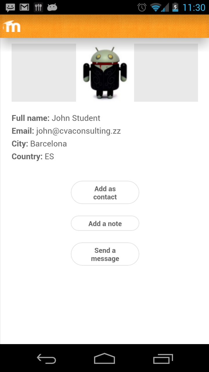
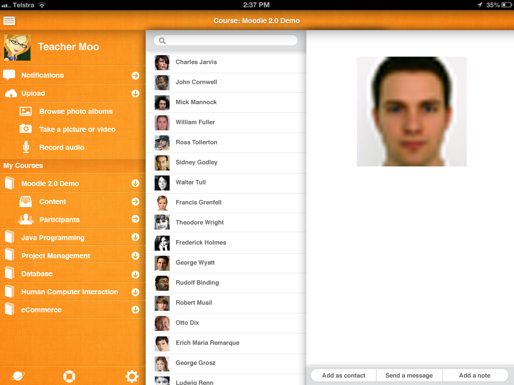
The current participant profile page could be improved (at the moment we have a center image with grey background, below some plain text without any links, button quite fade). In my opinion it's not very attractive. See screen capture.
Can you come up with new design? You can get inspiration from other contact profile of other popular apps.
To know what fields are possibly displayed, look at our previous app, in this video http://www.mylearningspace.com.au/lms/resources/news/moodle-mobile-app-for-iphone-review/ at minute 6:27, the reviewer speaks about what the app can display (phone number, map...)
- will be (partly) resolved by
-
MOBILE-386 Enhance participants submenu panel and content panel
-
- Resolved
-