-
Improvement
-
Resolution: Unresolved
-
 Minor
Minor
-
None
-
5.0
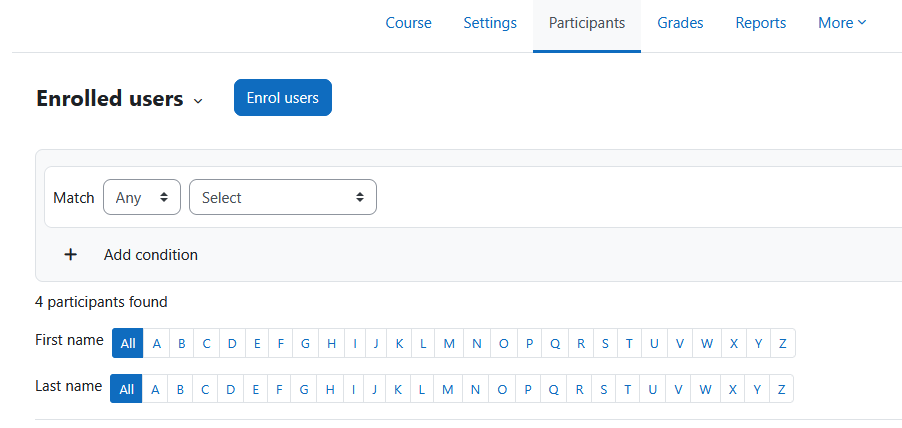
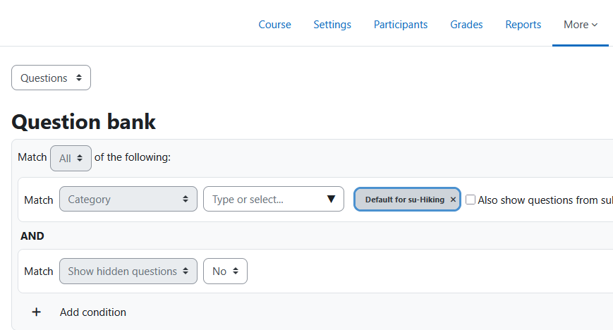
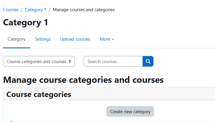
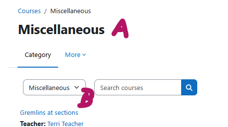
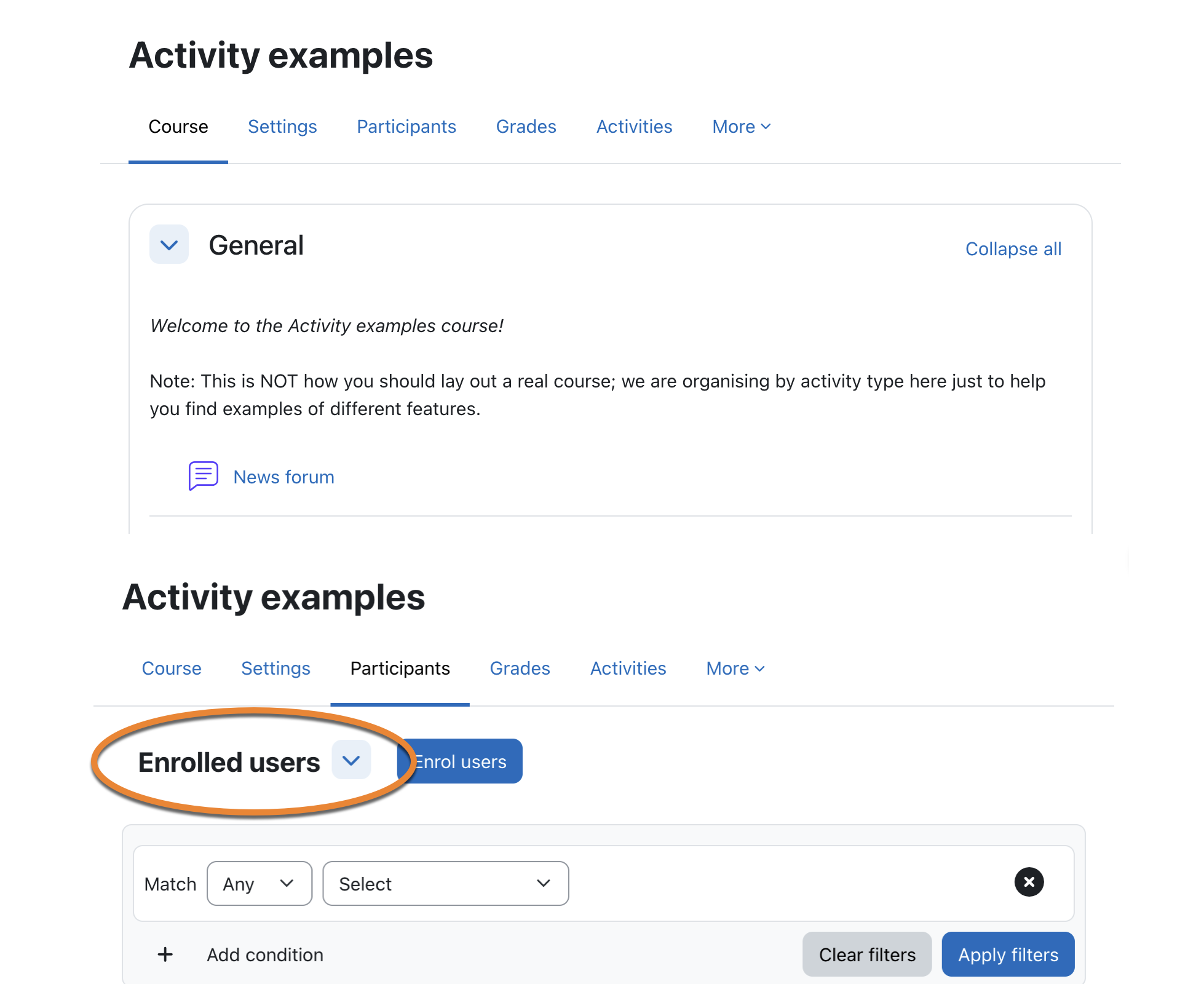
In moodle there are different ways how the tertiary navigations look like. That is not consistent and sometimes misleading (see screenshots).
Especially the way the navigation is displayed in the participants area in course is not recognizable as navigation for many users.
As a user I want to have a consistent UI for all tertiary navigations which clearly shows the possibility to navigate.


- will be (partly) resolved by
-
-
- Open
-