-
Improvement
-
Resolution: Fixed
-
 Minor
Minor
-
4.5
-
MOODLE_405_STABLE
-
MOODLE_500_STABLE
-
MDL-83840-main -
-
 Code verified against automated checks with warnings.
Checked
MDL-83840using repository: https://github.com/clransom/moodle.git main (0 errors / 1 warnings) [branch: MDL-83840-main | CI Job]
Built on: Wed Mar 19 06:50:26 UTC 2025
Code verified against automated checks with warnings. Checked MDL-83840 using repository: https://github.com/clransom/moodle.git main (0 errors / 1 warnings) [branch: MDL-83840-main | CI Job ] overview (0/0) , phplint (0/0) , phpcs (0/1) , js (0/0) , css (0/0) , phpdoc (0/0) , commit (0/0) , savepoint (0/0) , thirdparty (0/0) , externalbackup (0/0) , grunt (0/0) , shifter (0/0) , mustache (0/0) , gherkin (0/0) , Should these errors be fixed? Built on: Wed Mar 19 06:50:26 UTC 2025 -
Hiding a category on the course management page is a very fast one-click operation.
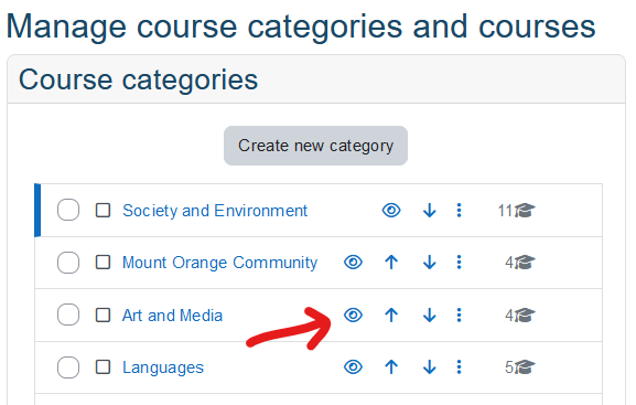
In the screenshot above, if you click the eye icon next to the 'Art and Media' category it will immediately be hidden, and students will immediately be unable to access any of the 4 courses in this category.
Hypothetically, suppose a member of staff was moving a category up the list, which means they have to click the 'Up arrow' button (right next to the eye icon) lots of times. Hypothetically, suppose that in the middle of all this frenetic clicking they misclicked the 'hide' button, but did not notice and just kept on clicking the up arrow. Hypothetically, they might have hidden the entire Business School category, blocking all student use to 50+ courses until there were enough hypothetical calls to helpdesk that somebody got contacted who could actually fix it. Hypothetically this would be quite bad and people might want the hypothetical institution to make sure it doesn't happen again. ![]()
This is a work of fiction. Names, characters, businesses, places, events, locales, and incidents are either the products of the author’s imagination or used in a fictitious manner. Any resemblance to actual persons, living or dead, or actual events is purely coincidental.
Obviously this hypothetical situatation is possible at any university, it seems an easily mistakeable interface because up/down are extremely low-consequence actions, and are located right next to what can be a high-consequence action.
While it would be possible to generally improve the interface on this page, as a simple short-term improvement, I suggest the following:
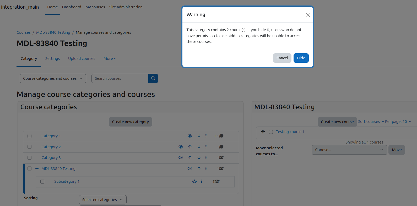
- When hiding a category, if the category is not empty (contains any courses or subcategories that contain courses) then show a confirm/cancel popup.
- Message for the popup could be something like: 'Warning: This category contains 17 courses. If you hide it, users who do not have permission to see hidden categories will be unable to access these courses.' (Hide) (Cancel)
There is probably no need for a confirm when showing a category, or when hiding an empty category.
I did also consider the alternative approach of moving 'Hide' to the dropdown menu where it is harder to click, but there may be some institutions that rely on hiding/showing categories frequently and it is also useful to clearly see the current hidden state, so I think the current interface has advantages and it's better to use a confirm prompt.
