-
Improvement
-
Resolution: Duplicate
-
 Minor
Minor
-
None
-
4.3.9, 4.4.5, 4.5.1
-
None
-
MOODLE_403_STABLE, MOODLE_404_STABLE, MOODLE_405_STABLE
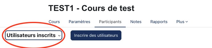
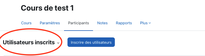
I noticed our teachers have difficulties to manipulate the tertiary menu because it does not look like a menu.
I propose css tweak to make the tertiary menu more clear ($brandcolor has to be replaced with your choosen brandcolor in boost parameters):
.tertiary-navigation .tertiary-navigation-selector .dropdown-toggle{
|
font-size:1.2rem!important; |
}
|
.tertiary-navigation .tertiary-navigation-selector .dropdown{
|
border:3px solid $brandcolor;
|
border-radius:0.5rem; |
padding-left:3px;
|
padding-right:3px;
|
}
|
Presentation before :

Presentation after :
