-
Improvement
-
Resolution: Unresolved
-
 Minor
Minor
-
None
-
4.5
-
MOODLE_405_STABLE
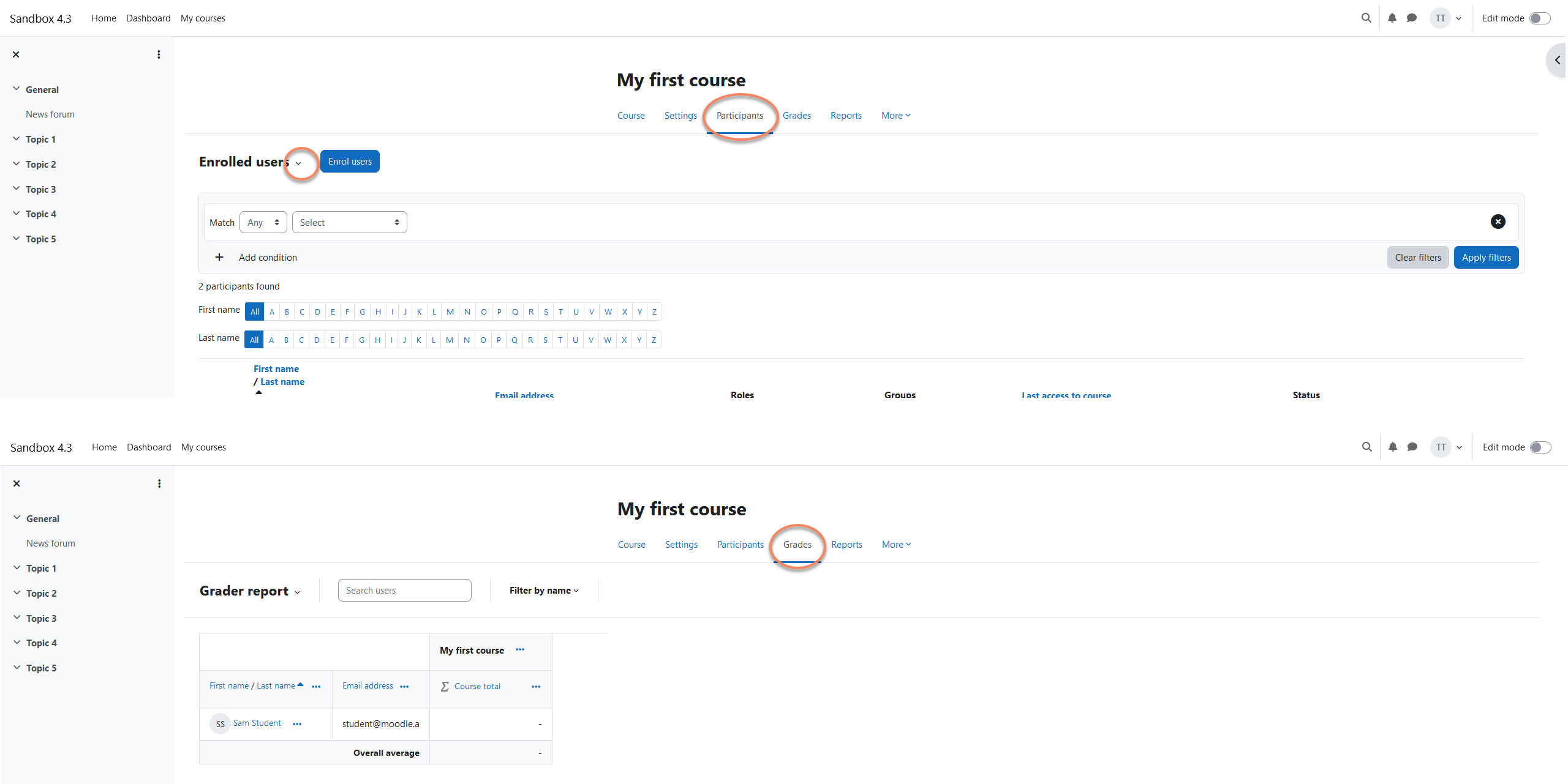
Many teachers of our large Moodle installation, who do not use Moodle reguarly, complain that the dropdown functionality of the secondary navigation - such as under "participants" and "grades" tab - is not visible. The arrow is too small and they hereby recognise this item more as a title than an interaction item (button). Further on they are e.g. struggling to find the group function that is inside of the dropdown element.
It would be great if the usability could be improved here by for example making the arrow bigger, more popping out or even providing a thin border around the dropdown element. I know from other big universities in Austria who feel the same way. Of course we could fix it individually easily by changing it via CSS, but I see this as an upstream topic for Moodle - and I'm sure that many Moodle users agree here.

- has a non-specific relationship to
-
MDL-78682 Items in the new Tertiary navigation dropdown are not links, and cannot be opened in a new tab
-
- Open
-
-
-
- Closed
-
- has to be done after
-
MDL-81418 UX review - Make dropdown functionality of secondary navigation more visible
-
- Open
-
- is duplicated by
-
-
- Closed
-
-
-
- Closed
-
- will help resolve
-
-
- Open
-