-
Improvement
-
Resolution: Unresolved
-
 Minor
Minor
-
None
-
4.1.9, 4.2.6, 4.3, 4.3.2
-
MOODLE_401_STABLE, MOODLE_402_STABLE, MOODLE_403_STABLE
-
3
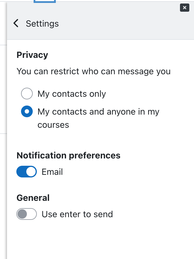
Checkboxes, radios and toggles may be failing WCAG 2.4.13 Focus appearance when enabled/selected as there is not enough contrast between the focuses and not focused state.
Non focused state
Checkboxes, radios and toggles are blue when enabled/selected
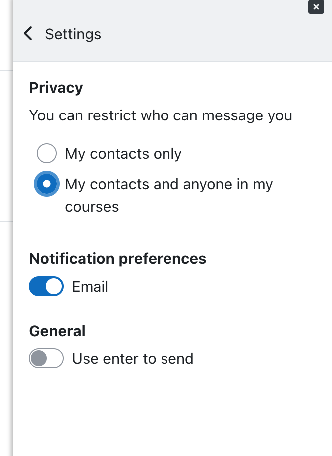
Focused state
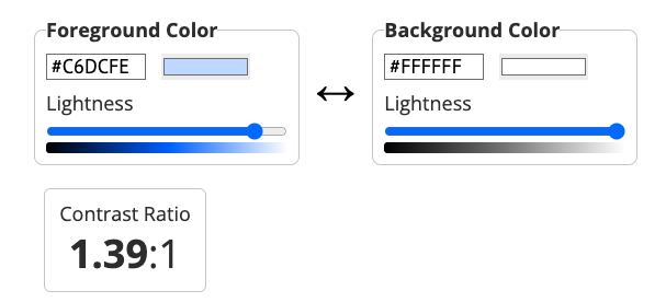
A box-shadow thicker than 2px is added to the input but there isn't enough contrast (3:1 minimum) and it's hard to distinguish from the non-focused state.


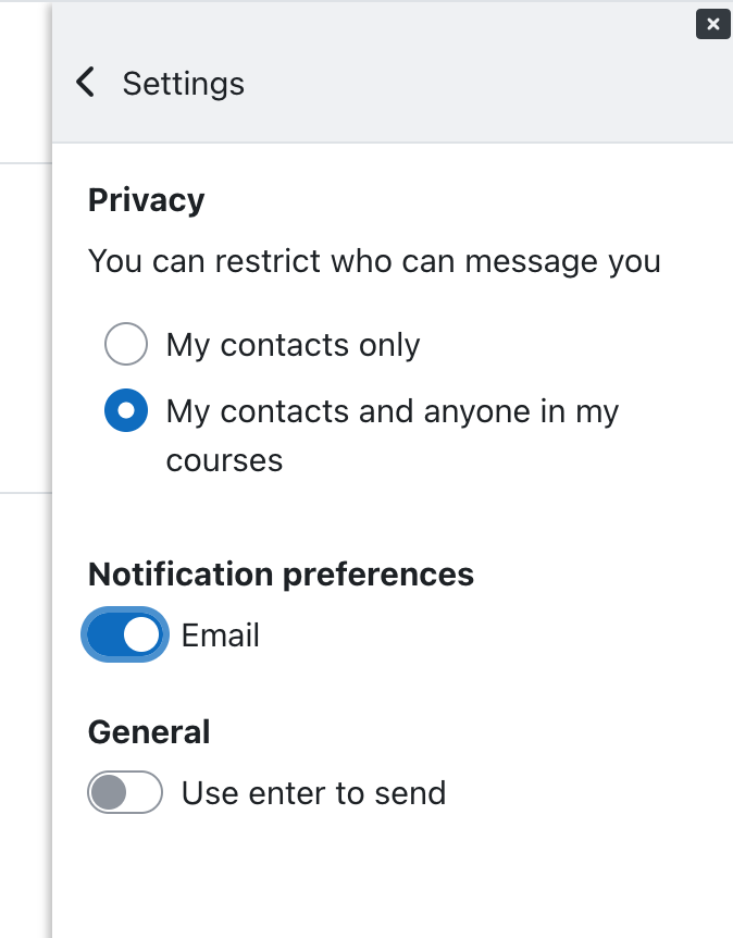
Proposed fix
Add a double coloured box-shadow to these elements, similarly to the button components.
For example:


- has been marked as being related by
-
MDL-67874 Improve the contrast of browser focus outline
-
- Closed
-
- has to be done after
-
MDL-80663 UX review - Focus indicator for checkboxes, radio buttons and toggles may be failing contrast requirements
-
- Closed
-
-
-
- Closed
-
- mentioned in
-
Page Loading...