Uploaded image for project: 'Moodle'
  1. Moodle
  2. MDL-75870

Bootstrap collapse in moodle 4.0 (boost)

XMLWordPrintable

    • MOODLE_400_STABLE, MOODLE_401_STABLE, MOODLE_402_STABLE
    • MOODLE_400_STABLE, MOODLE_401_STABLE
    • MDL-75870-401
    • MDL-75870-master
    • Hide
      1. Create a new "Text and media area" with HTML content of:

        <p>
          <a class="btn btn-primary" data-toggle="collapse" href="#collapseExample" role="button" aria-expanded="false" aria-controls="collapseExample">
            Link with href
          </a>
          <button class="btn btn-primary" type="button" data-toggle="collapse" data-target="#collapseExample" aria-expanded="false" aria-controls="collapseExample">
            Button with data-target
          </button>
        </p>
        <div class="collapse" id="collapseExample">
          <div class="card card-body">
            Some placeholder content for the collapse component. This panel is hidden by default but revealed when the user activates the relevant trigger.
          </div>
        </div>
        

        *NOTE:* You will likely need to use the HTML Source view in the text editor to put this content in

      2. Save changes
      3. Use the buttons in the newly created label
        1. Confirm that only the "Some placeholder..." text is hidden
        2. Confirm that the buttons remain visible
      Show
      Create a new "Text and media area" with HTML content of: <p> <a class="btn btn-primary" data-toggle="collapse" href="#collapseExample" role="button" aria-expanded="false" aria-controls="collapseExample"> Link with href </a> <button class="btn btn-primary" type="button" data-toggle="collapse" data-target="#collapseExample" aria-expanded="false" aria-controls="collapseExample"> Button with data-target </button> </p> <div class="collapse" id="collapseExample"> <div class="card card-body"> Some placeholder content for the collapse component. This panel is hidden by default but revealed when the user activates the relevant trigger. </div> </div> * NOTE: * You will likely need to use the HTML Source view in the text editor to put this content in Save changes Use the buttons in the newly created label Confirm that only the "Some placeholder..." text is hidden Confirm that the buttons remain visible

      Hi everybody,

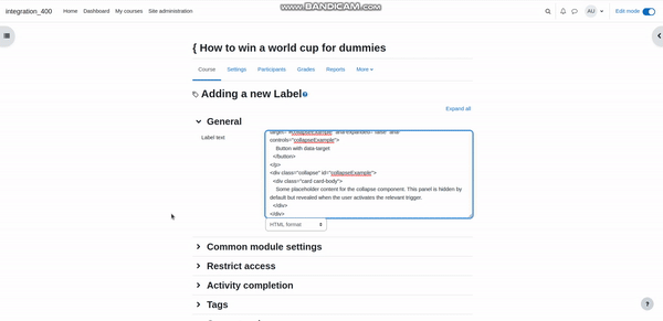
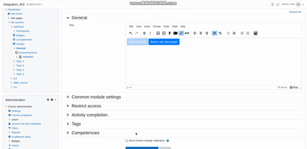
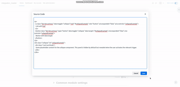
      we use Bootstrap accordion on every coursepage. It works well up to moodle 3.11, in moodle 4.0 (with theme boost) I noticed the following behaviour:

      Everytime I click to expand / collapse a segment of the accordion, the current section of the course is collapsed. This also happens when you use Bootstrap collapse in labels (e.g. the code from https://getbootstrap.com/docs/4.6/components/collapse/ ). The attribute data-target is set in both cases.

      Does anybody have an idea how to avoid this? 

      Thanks a lot for your help!

      Stefan

        1. Screenshot 2022-10-01 042740.png
          45 kB
          Stefan Zimmer
        2. 400.gif
          407 kB
          Ron Carl Alfon Yu
        3. 401.gif
          502 kB
          Ron Carl Alfon Yu
        4. master.gif
          683 kB
          Ron Carl Alfon Yu

            nwpotago Nick Phillips
            StefanZimmer Stefan Zimmer
            Daniel Neis Araujo Daniel Neis Araujo
            Andrew Lyons Andrew Lyons
            Ron Carl Alfon Yu Ron Carl Alfon Yu
            Votes:
            7 Vote for this issue
            Watchers:
            14 Start watching this issue

              Created:
              Updated:
              Resolved:

                Estimated:
                Original Estimate - 0 minutes
                0m
                Remaining:
                Remaining Estimate - 0 minutes
                0m
                Logged:
                Time Spent - 1 hour, 37 minutes
                1h 37m

                  Error rendering 'clockify-timesheets-time-tracking-reports:timer-sidebar'. Please contact your Jira administrators.