-
Bug
-
Resolution: Not a bug
-
 Major
Major
-
None
-
3.5 regressions, 3.7 regressions, 3.8 regressions, 3.9 regressions, 3.9.12, 3.10.9, 3.11.5
-
None
-
MOODLE_310_STABLE, MOODLE_311_STABLE, MOODLE_39_STABLE
Hello.
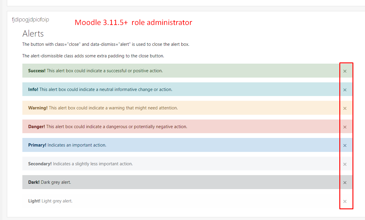
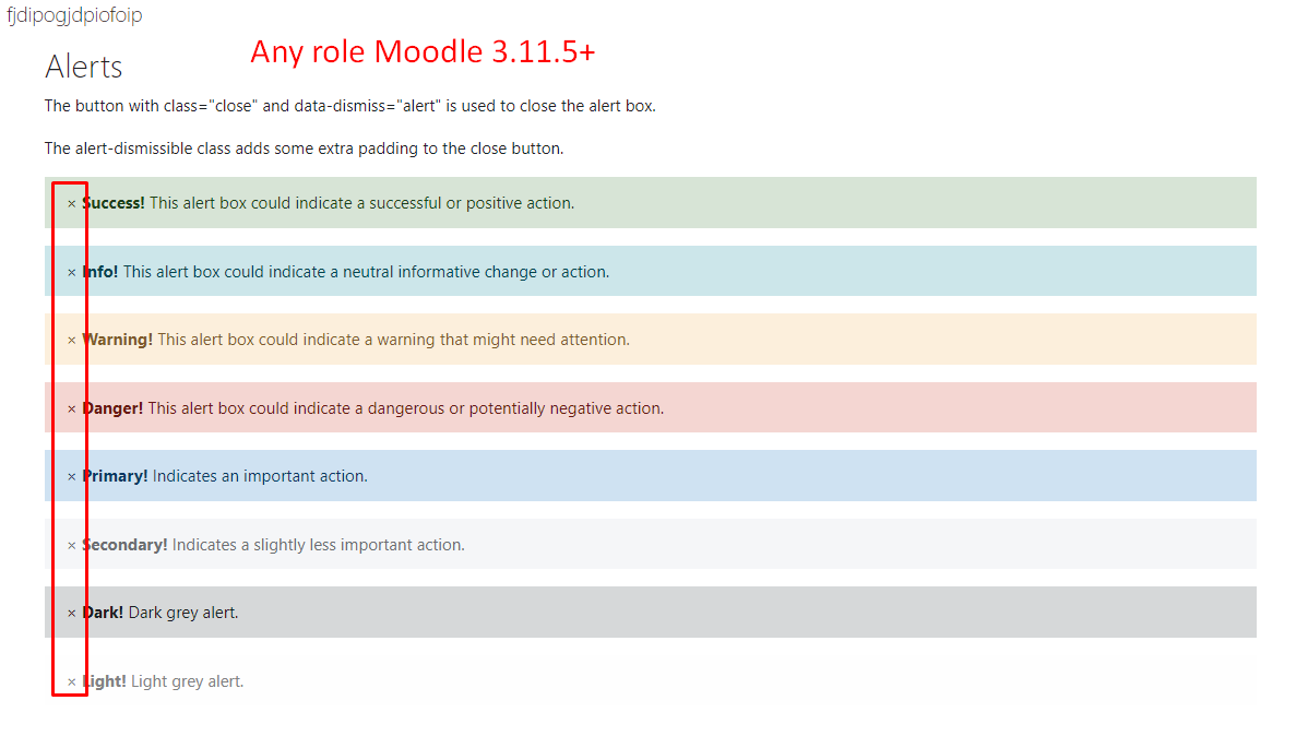
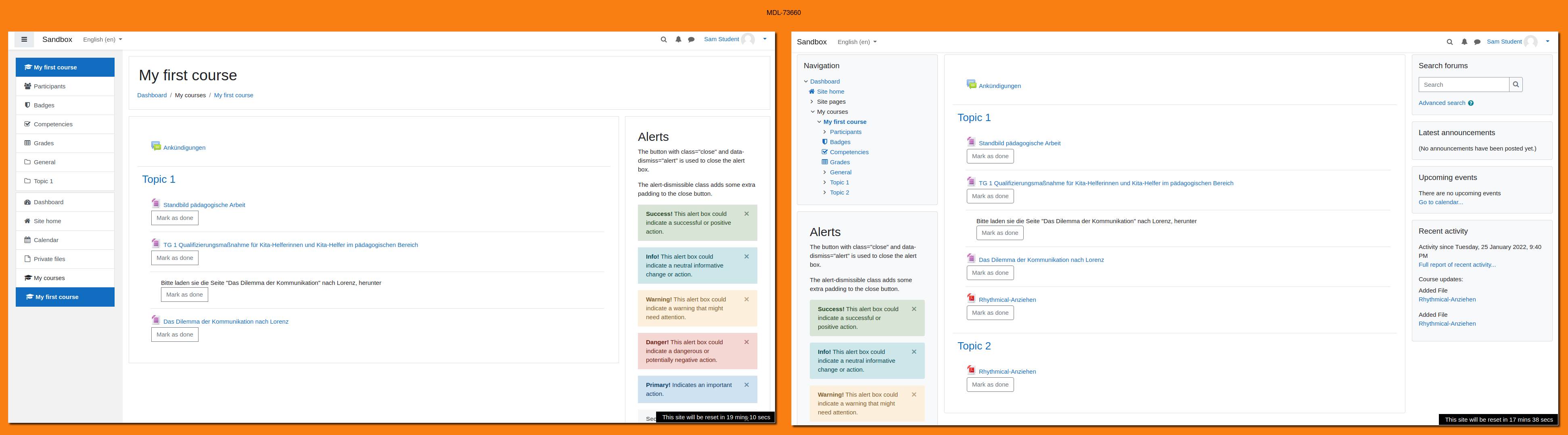
Moodle since version 3.5 does not allow me to correctly display the embedded html that I insert either in an html block or in a tag activity, this error occurs with all roles except the administrator user.
I have updated from version 3.4.9 to 3.11.5+ progressively to avoid problems during the update process.
I attach screenshots.
Added on 01/24/2022
The error shows up on all users, the only user that doesn't show that error is the admin user.
I created an html block in the personal area and added that html to the personal area of all users, in the same way within a course I created a label and added the same html and the only one that can visualize it well is the administrator user, the others they have reported inconvenience.
The following snippet is what I used in my lab moodle.
<div class="container">
<h2>Alerts</h2>
<p>The button with class="close" and data-dismiss="alert" is used to close the alert box.</p>
<p>The alert-dismissible class adds some extra padding to the close button.</p>
<div class="alert alert-success alert-dismissible">
<button type="button" class="close" data-dismiss="alert">×</button>
<strong>Success!</strong> This alert box could indicate a successful or positive action.
</div>
<div class="alert alert-info alert-dismissible">
<button type="button" class="close" data-dismiss="alert">×</button>
<strong>Info!</strong> This alert box could indicate a neutral informative change or action.
</div>
<div class="alert alert-warning alert-dismissible">
<button type="button" class="close" data-dismiss="alert">×</button>
<strong>Warning!</strong> This alert box could indicate a warning that might need attention.
</div>
<div class="alert alert-danger alert-dismissible">
<button type="button" class="close" data-dismiss="alert">×</button>
<strong>Danger!</strong> This alert box could indicate a dangerous or potentially negative action.
</div>
<div class="alert alert-primary alert-dismissible">
<button type="button" class="close" data-dismiss="alert">×</button>
<strong>Primary!</strong> Indicates an important action.
</div>
<div class="alert alert-secondary alert-dismissible">
<button type="button" class="close" data-dismiss="alert">×</button>
<strong>Secondary!</strong> Indicates a slightly less important action.
</div>
<div class="alert alert-dark alert-dismissible">
<button type="button" class="close" data-dismiss="alert">×</button>
<strong>Dark!</strong> Dark grey alert.
</div>
<div class="alert alert-light alert-dismissible">
<button type="button" class="close" data-dismiss="alert">×</button>
<strong>Light!</strong> Light grey alert.
</div>
</div>