-
Bug
-
Resolution: Fixed
-
 Minor
Minor
-
4.0
-
MOODLE_400_STABLE
-
MOODLE_400_STABLE
-
MDL-73562-master -
The alignment of the content bank has some issues after the pagewidth has changed
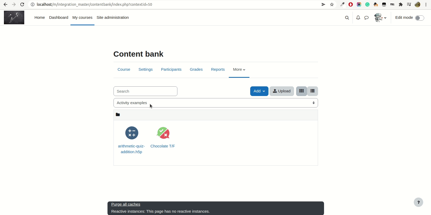
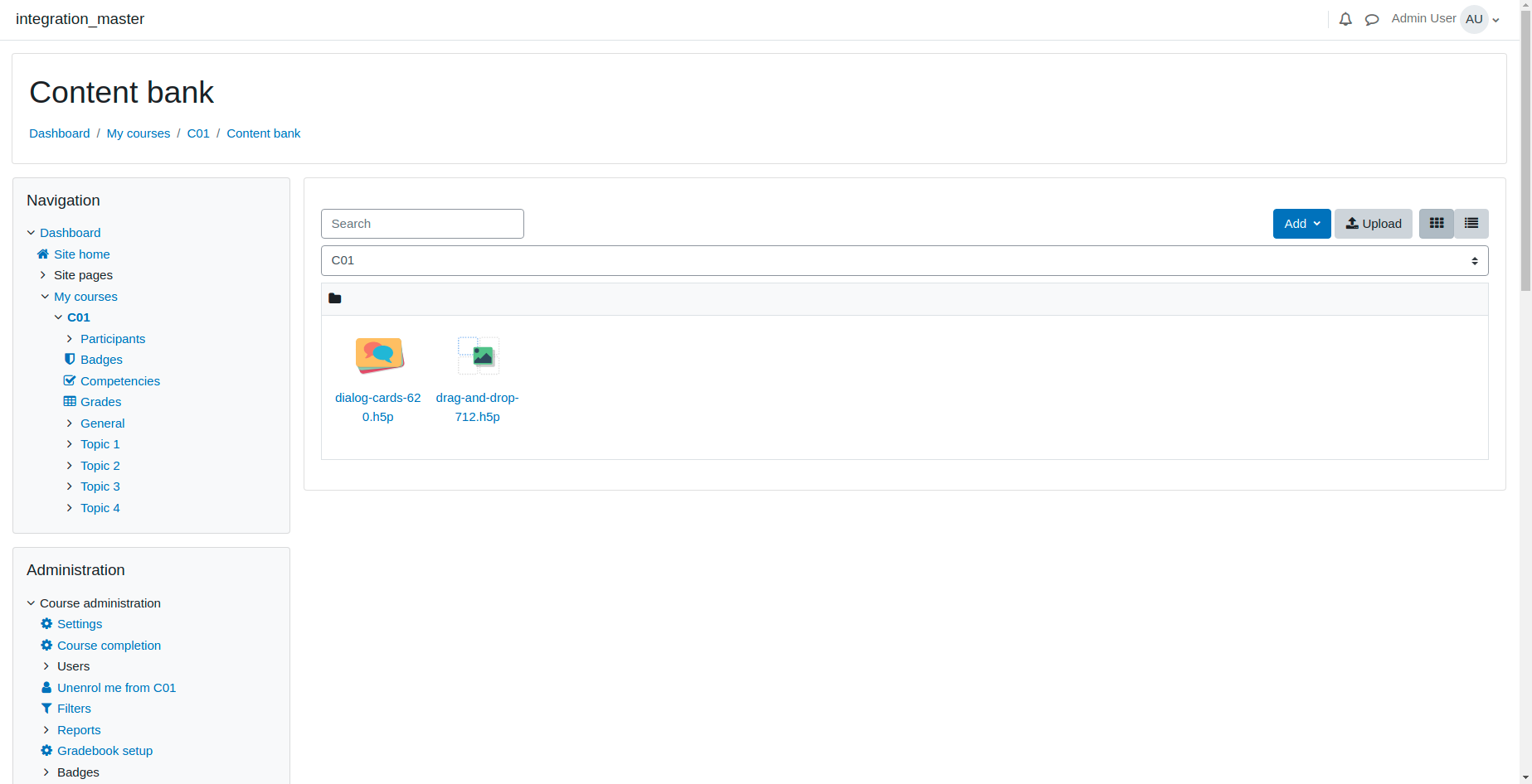
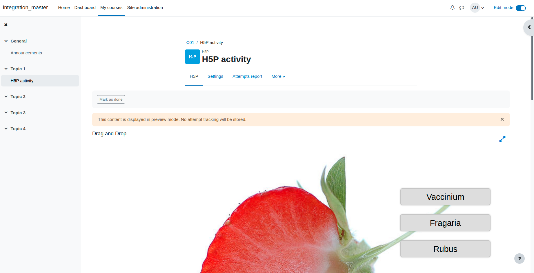
Buttons alignment
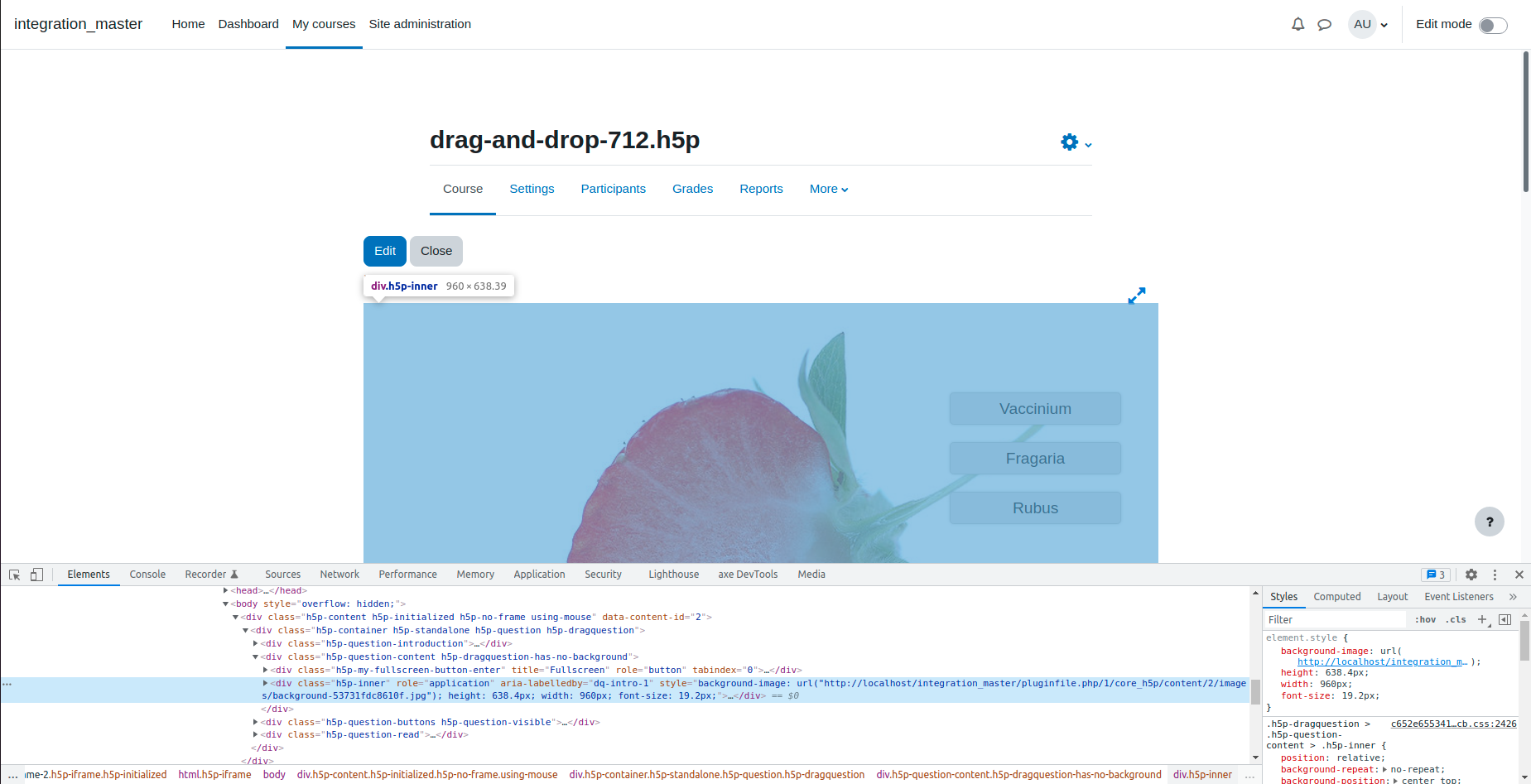
Preview
The button is currently aligned to the right when previewing a content. The new design paradigm in Moodle is to have all buttons aligned to the left.
I see two different approaches to this:
a) Aligning the buttons with the H5P content
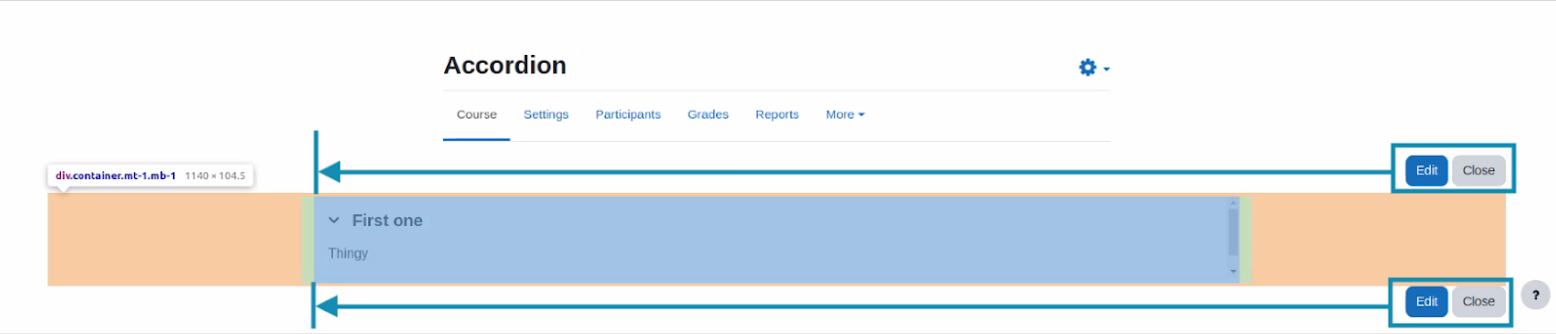
In this solution we use the same padding / margin to visually align the buttons next to the rendered content. I’m not sure if this solution is the more scalable one, since paddings and margins can change from one content to another. I can’t predict what would happen with different content.
b) Aligning the buttons to the left of the page

This solution looks more robust and future-proof to me. It looks worse in full width page layouts though.
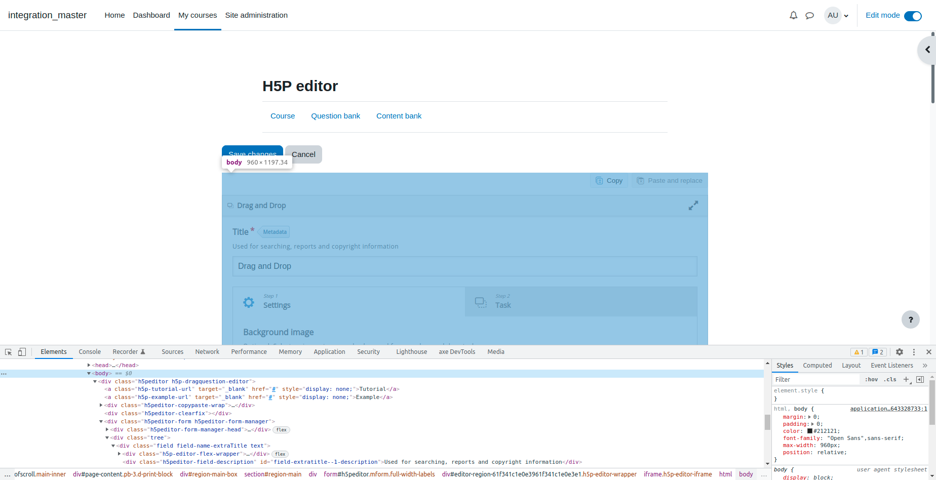
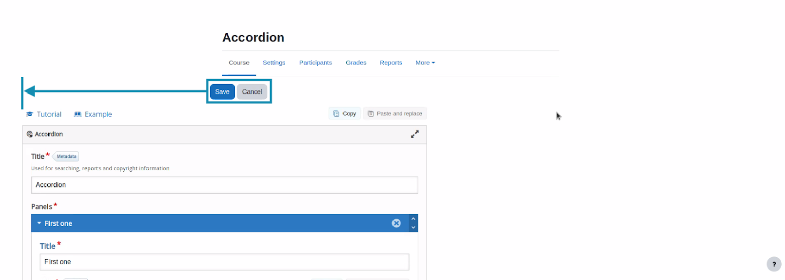
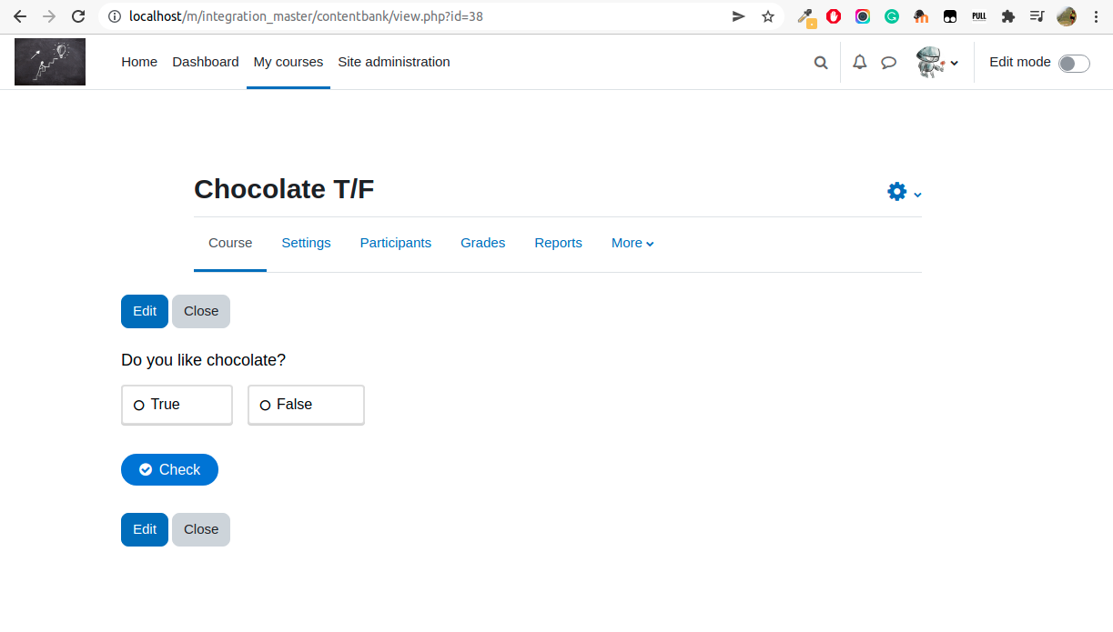
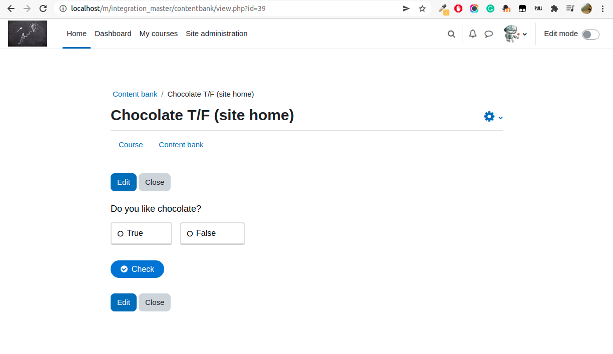
Edit
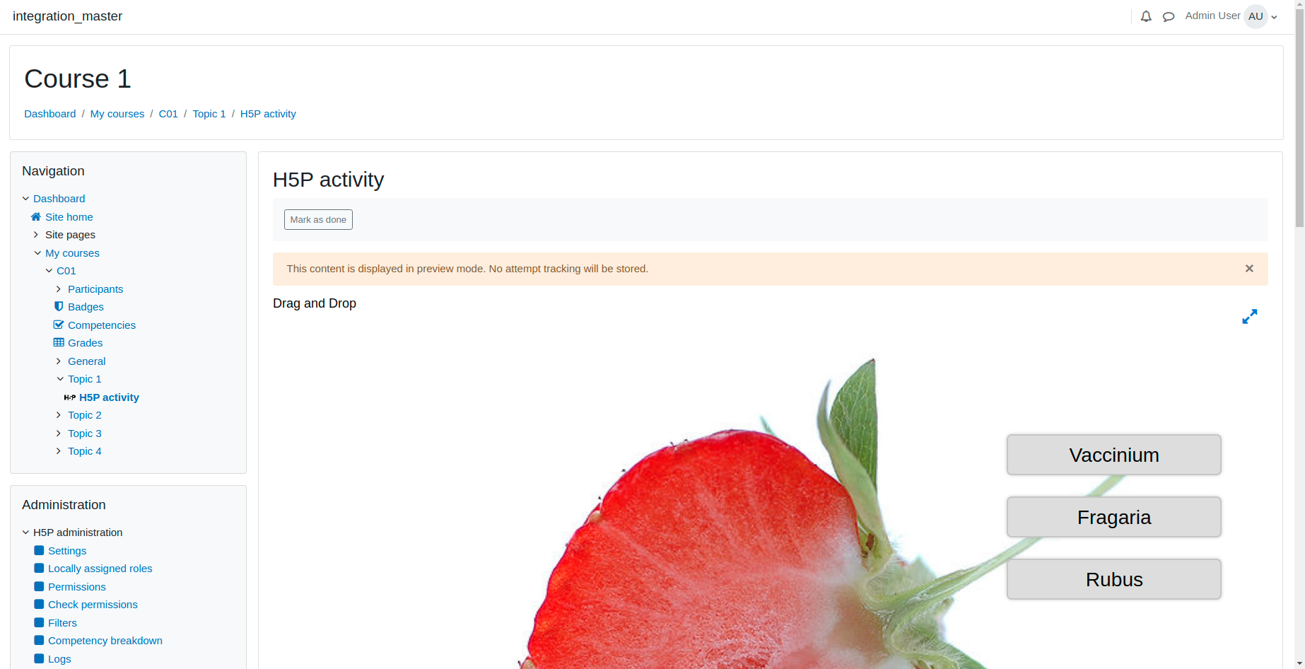
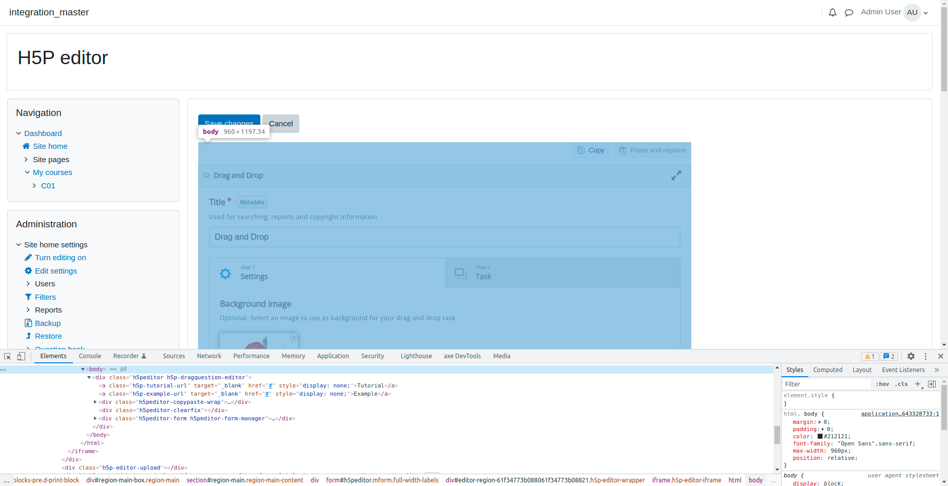
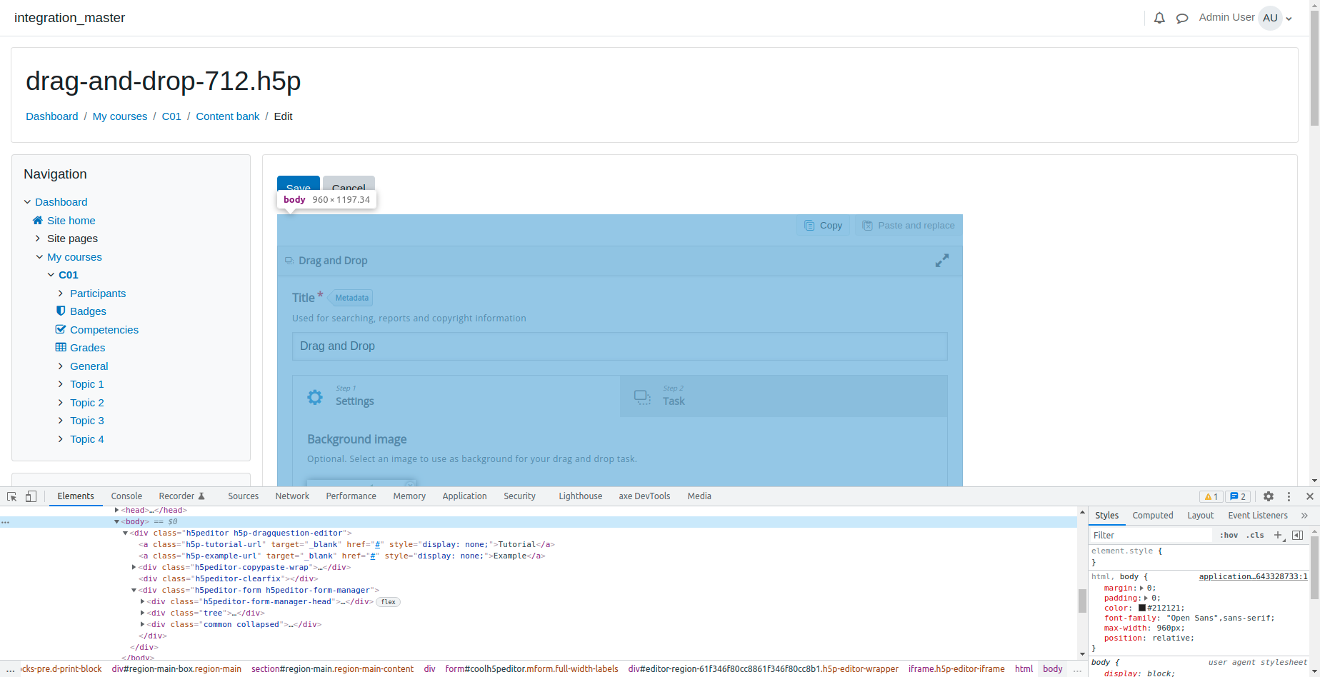
We have different problems when editing a content.
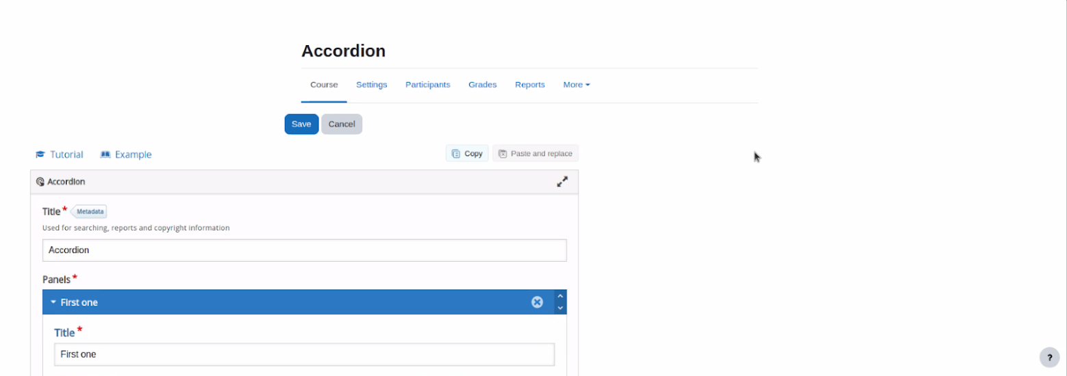
Buttons
Being a Moodle form, the buttons have a left padding that needs to be removed. By doing this, the buttons should align to the left of the page.

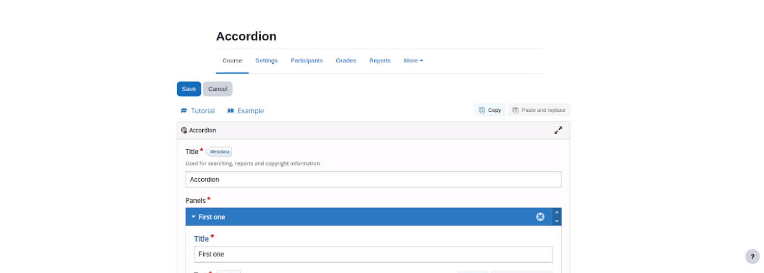
Content
We should align the content to the center of the page. If possible, the buttons should remain aligned to the left of the content when doing so.

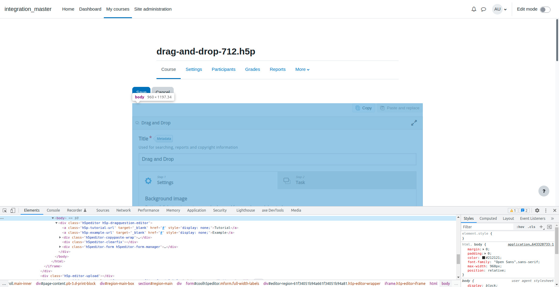
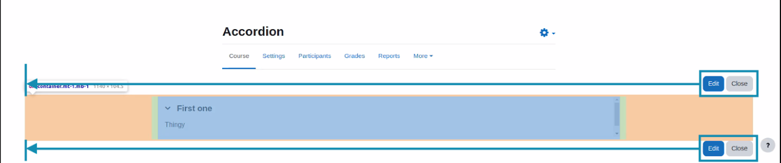
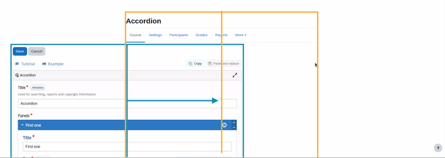
The result would be something like this:

Notice that the content in this example is wider than the navigation tab, so the content seems misaligned if compared with the left side of it. I’m not sure, but I think that unless we set this page to a fixed-width instead of full-width this will probably keep happening.
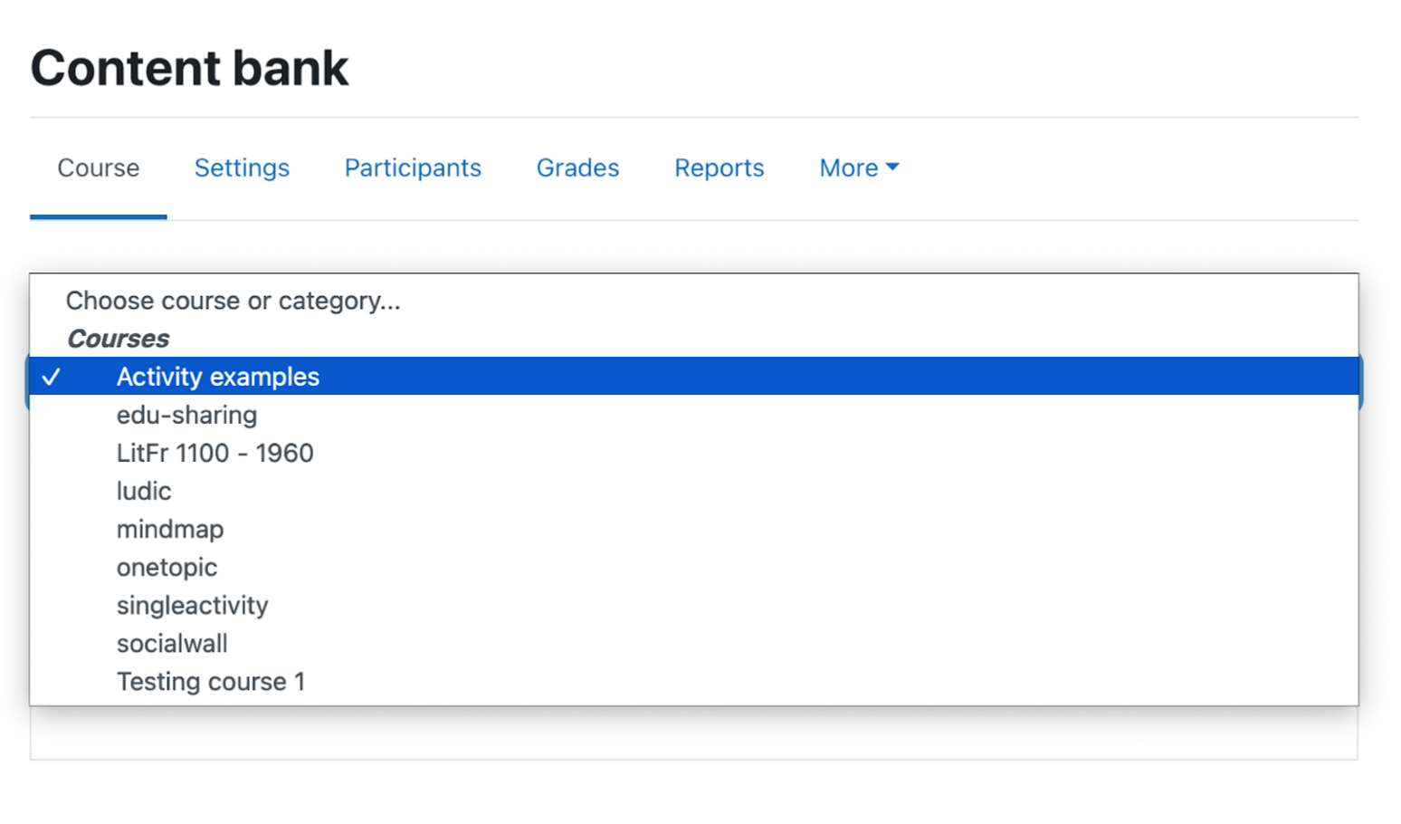
Context selector
The current context selector is too small for users to read the whole course and category names in the dropdown menu.
As a solution, we could print this selector in a whole row below the current controls.
It would look like this:


- will help resolve
-
-
- Closed
-
