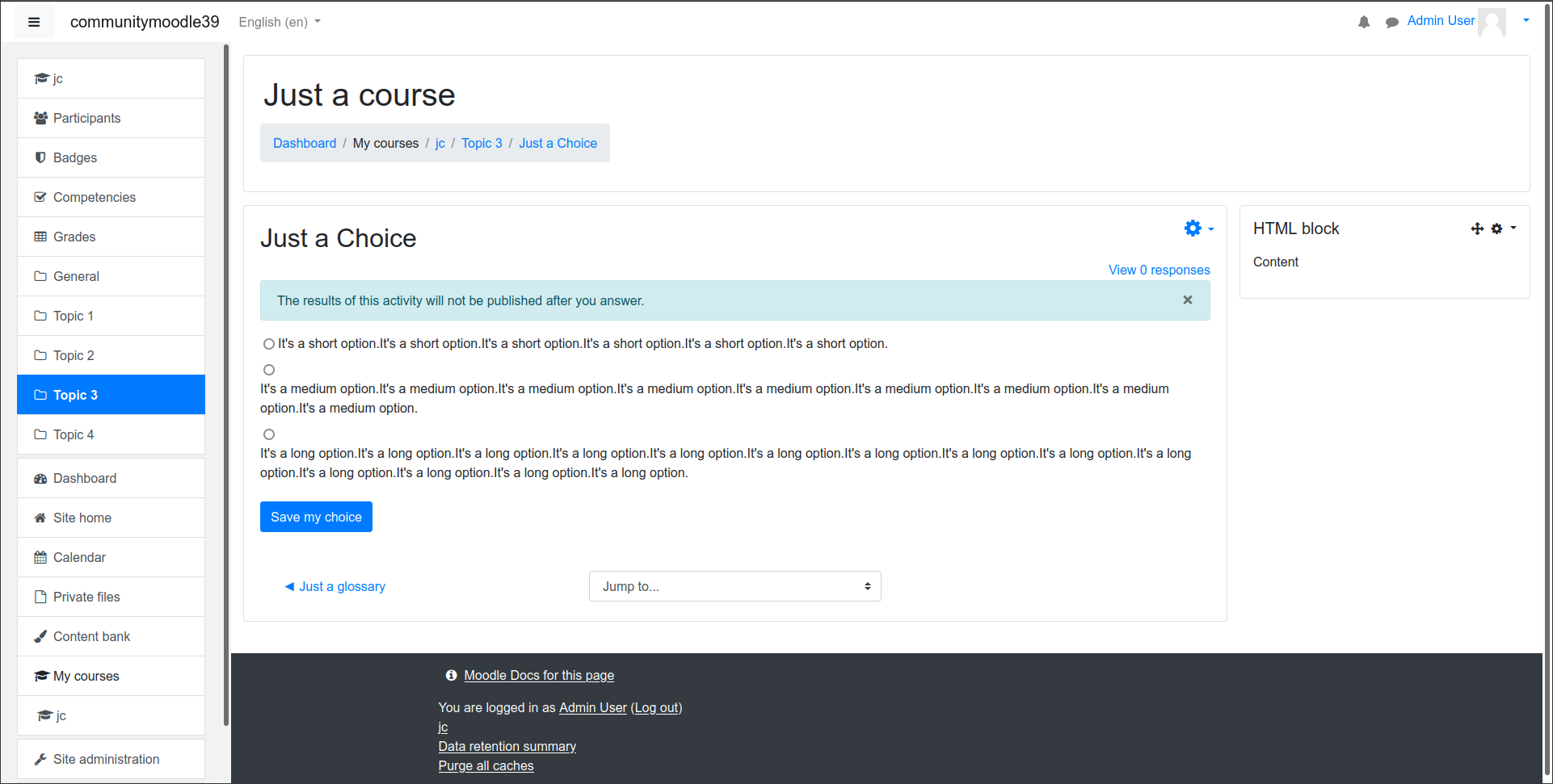
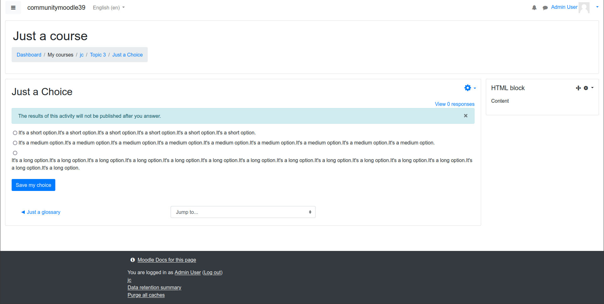
If the text in choice option is very long the radio button (or the checklist) takes one row while the option itself goes to another like there is a line break between them.
It is not the user interface elements that should change rows in this case but the text of the option should be divided into several rows while remaining inline with the radio button or the checkbox.