-
Bug
-
Resolution: Duplicate
-
 Minor
Minor
-
None
-
3.11.2
-
MOODLE_311_STABLE
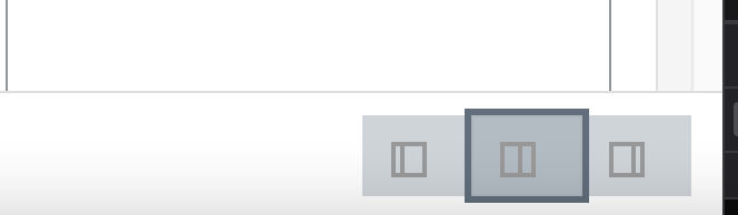
The 3 SVG icons used to open/close the grading interface are middle gray on a btn-secondary and so hard to see. Ideally they would be Font Awesome icons so that they could pick up the theme button text colors and react to hover etc.
Font Awesome doesn't have these exact icons, but notably they're not very obvious. The one on the left is "hide the left pane", the one on the right is "hide the right pane" and the one in the middle, which is probably the best of the three means show both panes.
Font Awesome does have a "columns" icon that looks like the middle one, and possibly one of the many arrow themed icons could be used for the other two without too much being lost?
https://forkaweso.me/Fork-Awesome/icon/columns/
https://forkaweso.me/Fork-Awesome/icon/caret-square-o-right/
- duplicates
-
-

- Closed
-
