Uploaded image for project: 'Moodle'
  1. Moodle
  2. MDL-62933

Prev/Next/Jump course navigation too dominant and counter-productive at some places

XMLWordPrintable

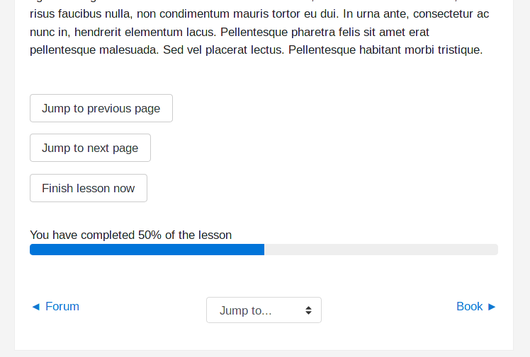
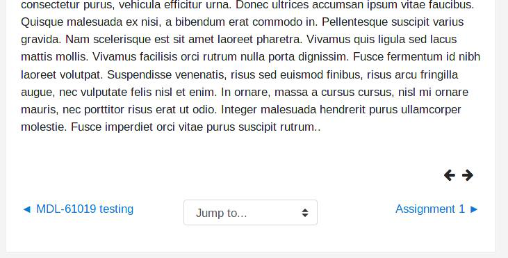
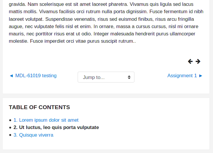
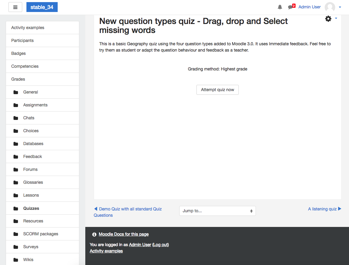
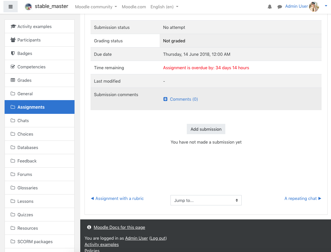
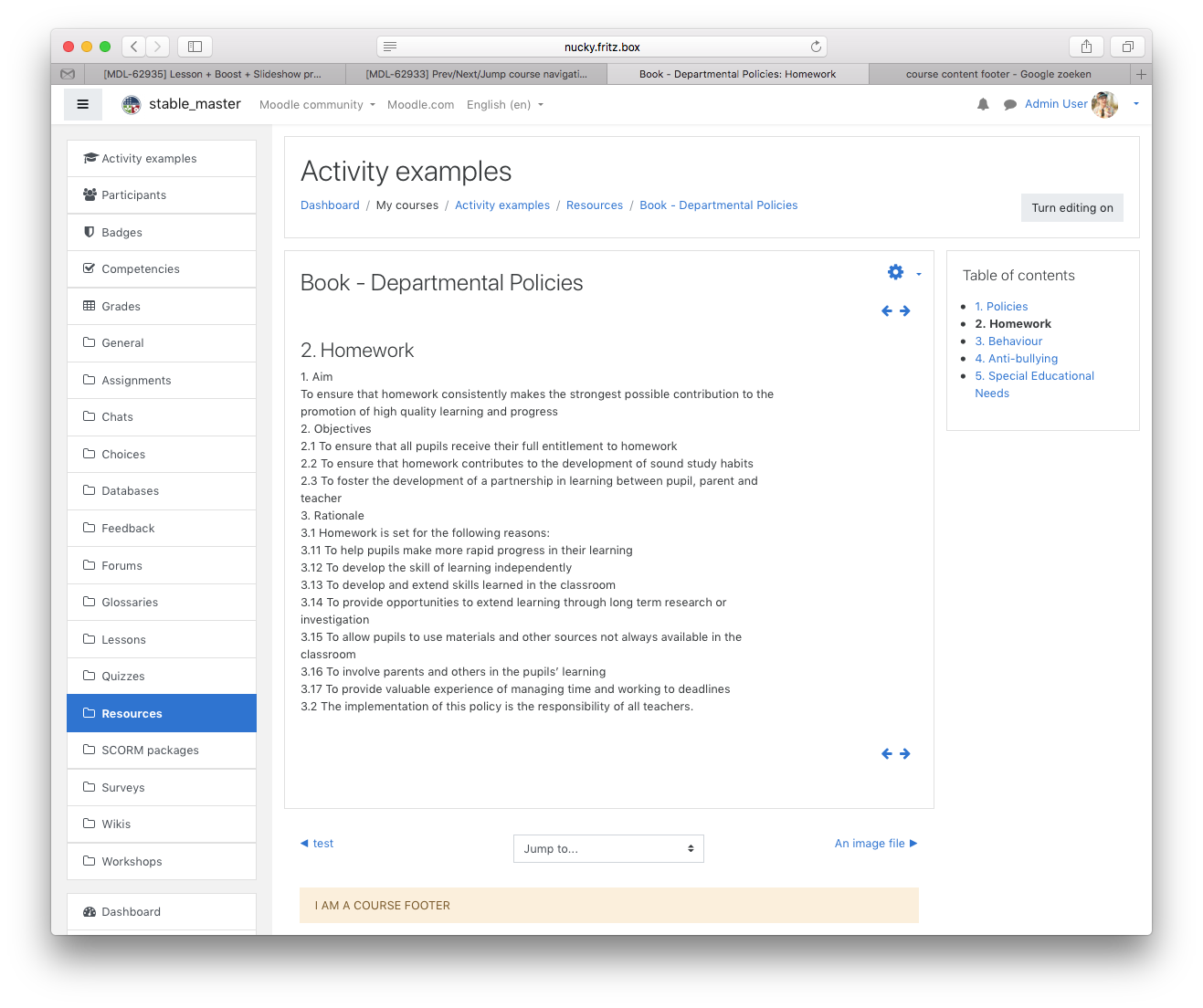
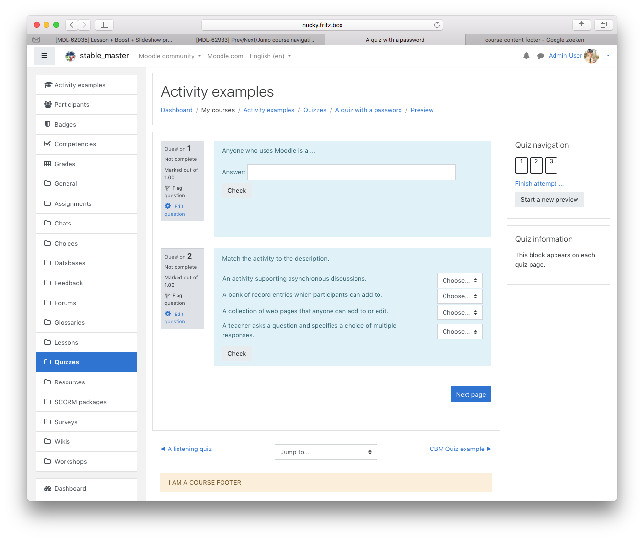
      In many places, I found there is no visual divider between the page's main context and the course navigation widgets Previous activity / Jump to activity / Next activity. I already saw people to get lost because clicking on the wrong link and I often find myself clicking the wrong one, too.

      I believe we should split and move those prev / next / jump to into their own visual region.

      This is particularly apparent on pages that have their own navigation elements such as Lessons or Books.

      The course navigation seems to overweight those and catch user's attention first. Going to the next activity implies loosing the current context. It should not be the first thing you think to do. The UI should help learners to focus on what's essential in where they currently are.

        1. screenshot-1.png
          30 kB
          David Mudrák (@mudrd8mz)
        2. screenshot-2.png
          224 kB
          David Mudrák (@mudrd8mz)
        3. screenshot-3.png
          43 kB
          David Mudrák (@mudrd8mz)
        4. boost34.png
          130 kB
          Bas Brands
        5. boost35.png
          125 kB
          Bas Brands
        6. book.png
          229 kB
          Bas Brands
        7. quiz.png
          194 kB
          Bas Brands
        8. quiz.png
          194 kB
          Bas Brands
        9. book.png
          229 kB
          Bas Brands

            basbrands Bas Brands
            mudrd8mz David Mudrák (@mudrd8mz)
            Votes:
            4 Vote for this issue
            Watchers:
            7 Start watching this issue

              Created:
              Updated:
              Resolved:

                Error rendering 'clockify-timesheets-time-tracking-reports:timer-sidebar'. Please contact your Jira administrators.