-
Improvement
-
Resolution: Deferred
-
 Minor
Minor
-
None
-
3.5, Future Dev
-
MOODLE_35_STABLE
-
MDL-61021-action-tables-trait -
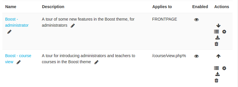
All through moodle there is many 'action tables' which are usually a flexible_table and there is this convention that the right most column contains a set of actions. How this is done on every page is completely manual. Some times there are pages which have a table and conceptually have a bunch of actions but it's implemented completely differently, eg the assignment grading page has the actions tucked into a drop down menu at the bottom of the page, so doing something very simple like selecting two assignment in the middle of the table requires a bunch of scrolling to then perform the action.
There is lots of small subtle ways this concept of an action table could be made much more usable, and also refactor this heaps so it's much simpler for someone to create one of these new tables and make it really usable without extra effort.
What I have in mind is create a new class called action_table which manages the actions for you. In that class you define a method that declares all the actions, and each action would have:
- lang string
- icon
- url template
- availability conditions - there would be several preset ones like: first, notfirst, last, notlast, zero, single, multi
- there can also be custom availability which would be a client side boolean function
Additionally actions could be logically grouped together into sets. Possibly sets could be nested but I'm in two minds about this.
On top of this, the table itself has a couple flags that can be set as needed:
- specify that we want to be able to select rows or not - if set renders a checkbox for every row
- specify if rows can be reordered or not, if so then it manages the up / down arrows for you and also turns on drag and drop reordering.
You should also be able to declare a 'primary action' for each row, which is what happens if you click anywhere on the row itself (eg Fitt's law in action)
Then when you render the table this action column is managed completely by the base class for free. If the table can be reordered the up / down arrow actions are managed for you for free, you just provide the js / ajax / webservice which handles it and the class handles all the gui.
Now we can more easily do a whole bunch more UX magic leveraging these actions:
1) Improve the icon rendering by making the icons white-space nowrap so they line up consistently. We would do this for each 'group' so there is still some wrapping but it's consistent.
This is such a low hanging fruit, but doing it right now means touching a whole ton of places. And it's one of those tiny things that every prospective moodle client cringes at when they first jump into a page and the actions are just an ugly mess.
vs

2) We could render the actions in a context menu for any row. On desktop it's much quicker to just right click on any row and select an action rather than hunt and peck through the tiny icons. Each group of actions would render as context menu items with a separator. Items which are not available would be disabled /not shown. (Note if we allow nested sets of item then these would appear as sub menus in the context menu)
An example from gmail:
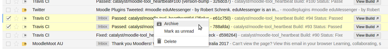
The context menu event is well supported and on mobile it can also be wired up to a long tap or a force tap.
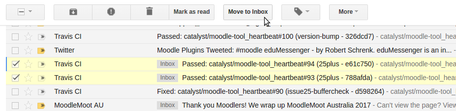
3) If the multi select option is on, then we can render actions along the top as buttons. If you want to do something like selected 5 items and then delete them all, or mark them as read. This table header would be sticky as you scrolled down (at least on desktop). (Note if we allowed nested sets, then these would appear as a sub menu like the 'Tags' and 'More' menus in the gmail example below:

4) If multi select is switched on, then like in the gmail screen shot above there would be a convenience 'all' selector to quickly toggle on or off all records. There would also be convenience shortcuts to select multiple rows matching existing desktop UI conventions:
- if you click on the first row and then shift click on another row it will select the whole contiguous set of rows
- if you control click it selectively toggles on and off individual rows
Note: if a 'primary action' is declared (ie click on a row to open the record) then you could still do the above but only by clicking on the left checkbox part of each row, not the full row for the initial click. Subsequent shift / control clicks are still fine anywhere on the row.
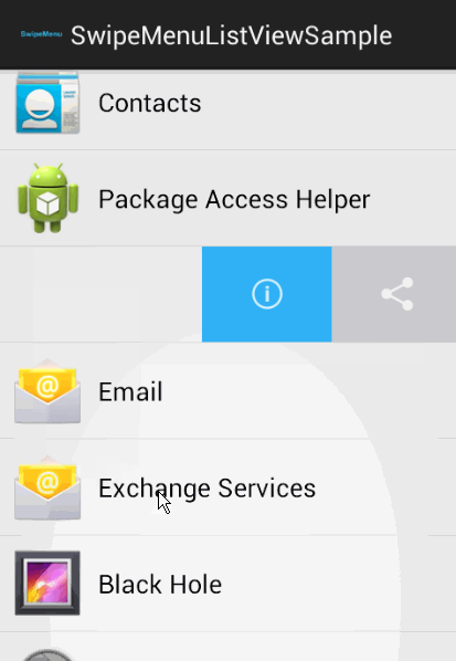
5) A stretch goal might be to adapt this to more mobile specific conventions, eg on mobile the table is responsively reduced to a look like a list view, and the action column is gone. But you could swipe right to reveal the set of actions. There is not much room here so it would probably only expose the first 2 actions and then the rest are under 'more'

Pages like the assignment grading page would be much more usable under this UI model. Across the board moodle would feel much more modern and less clunky, and the development burden would be much lighter.
- is duplicated by
-
MDL-67041 UX review of Moodle tables and action icons / menus
-
- Closed
-