-
Bug
-
Resolution: Won't Do
-
 Critical
-
None
-
2.5.1, 2.6.2
-
MOODLE_25_STABLE, MOODLE_26_STABLE
-
MDL-42483-master -
-
Team '; drop tables Sprint 9, Team ';drop tables Sprint 10
-
Medium
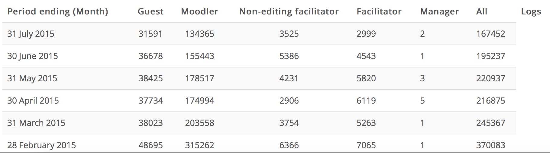
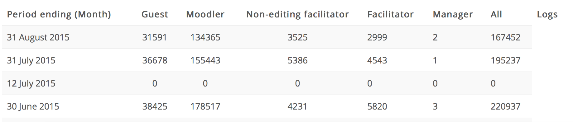
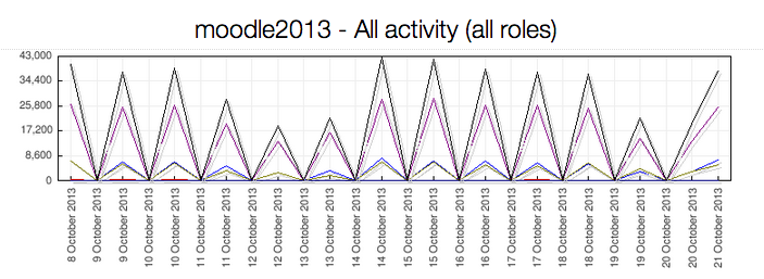
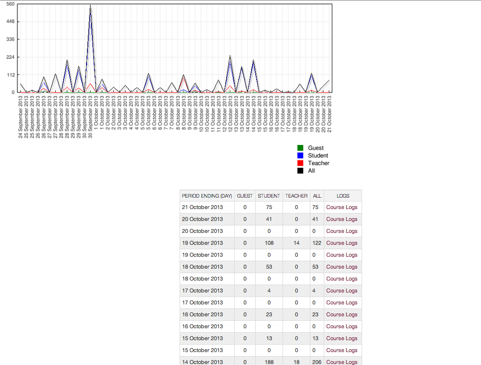
I've noticed that the graphs/data for statistics reports need some fine-tuning.
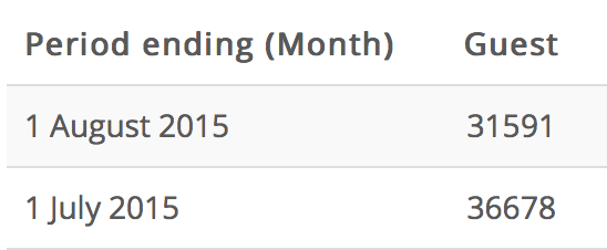
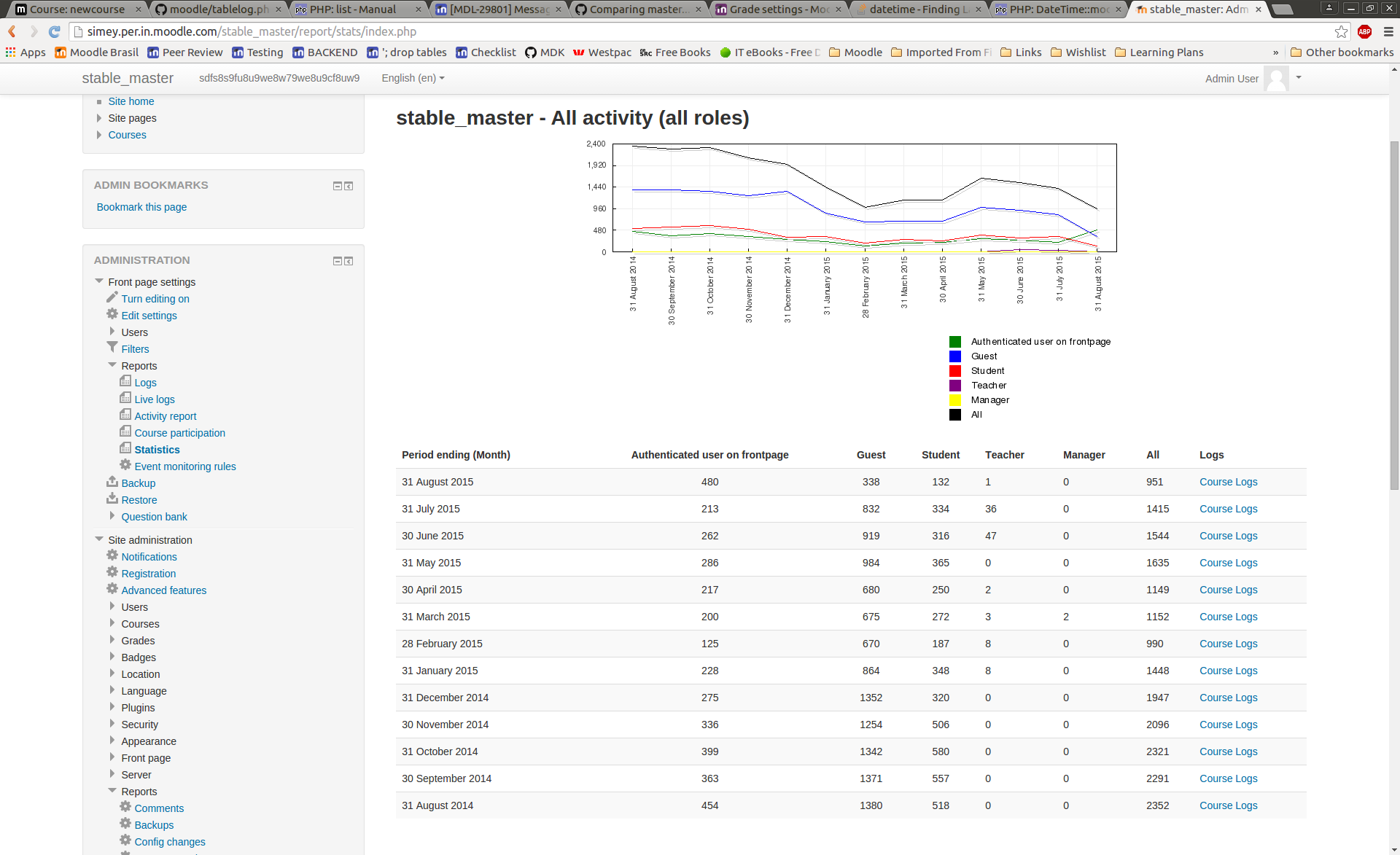
At the site level, Statistics Report graphs show two data points for each day or week period. Same label for day increments, and for week increments it shows the first and last day of that week. The first is a value of zero for the "period ending" and the second has a accurate (I'm assuming) values. The table below the graph doesn't list this duplicate data point.
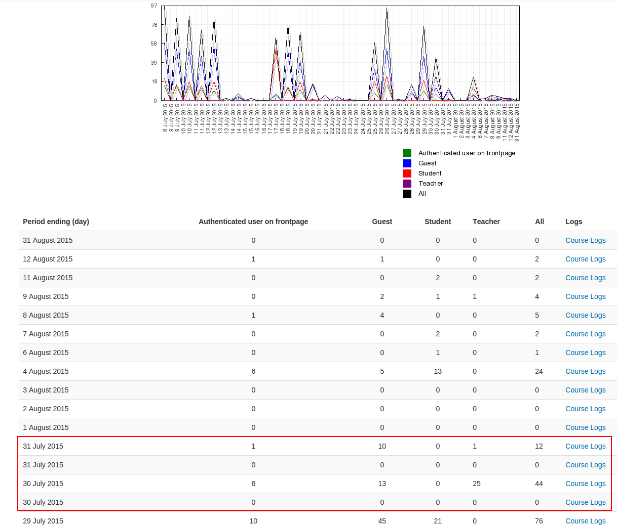
At the course level however, the statistics report shows a graph as described above AND the data table lists a row of zero data for each week of good data - which seems to be indicating the start of the period not the end.