-
Bug
-
Resolution: Fixed
-
 Minor
Minor
-
2.4.1
-
MOODLE_24_STABLE
-
MOODLE_25_STABLE
-
master_
MDL-37907 -
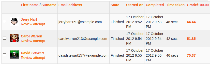
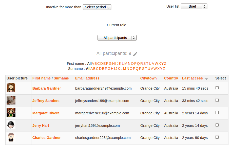
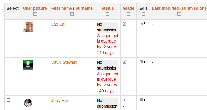
the "brief" participants page layout places the checkbox as the last column of the table - most other reporting pages that list users in a table place the checkbox in the first column.
This becomes a problem when the size of the middle column is small and in some themes (magazine is a good example) the checkbox is completely hidden unless using the scroll at the bottom of the table - but in using the scroll you can hide the users name and can't tell which user you're making the selection on.
I think it makes sense to change the layout of the page to place the checkbox before the users name like on other report pages (quiz reports/assignment reports etc)
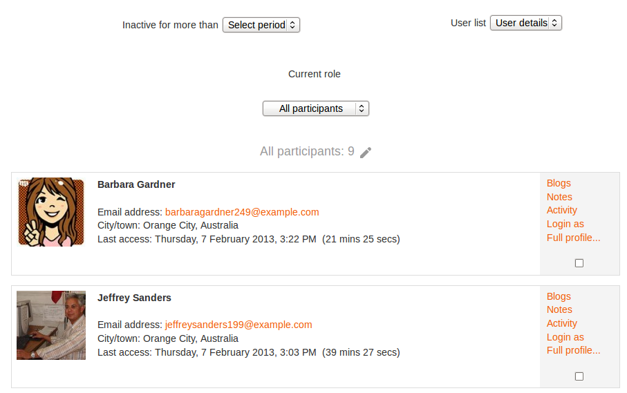
I'm not sure about the "user details" view of the participants page - I think it makes sense to leave the checkbox in it's current location though.