-
Bug
-
Resolution: Fixed
-
 Minor
Minor
-
2.1, 2.2
-
None
-
Any
-
MOODLE_21_STABLE, MOODLE_22_STABLE
-
MOODLE_21_STABLE
-
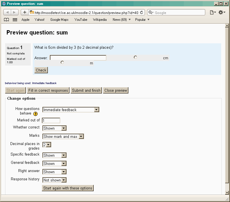
When units are used in a numerical or calculated question, and are displayed as a "multiple choice selection", the resulting radio buttons are poorly aligned on the screen. They are shown to the right of the answer field, with no table or CSS to align them, so in the small preview window the second radio button breaks onto a new line and appears underneath the answer field. (See image)
Similar problems present themselves if you position the units to the left of the field.
I have tested in Standard theme, using Safari 5.0.5, IE8 and Firefox 6.02 (all on Windows XP).
Steps to reproduce:
- Create a new numerical question
- Add a name, question text, a correct answer with grade = 100%, and a wildcard answer with grade = 0
- Set unit handling to "the unit must be given"
- Set "units are input using" to "multiple choice selection"
- Set "units go" to "on the right"
- Add extra unit blanks, and enter "cm" as unit 1 and "m" as unit 2 with multiplier 0.01
- Save changes
- Preview this question
The attached image shows how this appears, with the 'cm' button to the right of the field, and the 'm' button underneath the field.
I would expect to see the options presented in an organised grouping to the right of the table.