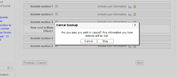
When doing the backup/restore process there is an evil Cancel button right next to the button you actually need to click. Tim and I were looking at it and I said, wow, that button's pretty evil. Then ten minutes later I used ihe feature again and really did click it by accident. Clicking on it seems to lose all the work you've done so far in the restore process!
Suggestions:
1) There should probably be no Cancel button - users can click the breadcrumbs to jump elsewhere if they want.
or
2) If a Cancel button is required there should be a large space between that button and the Next button you actually want to click. Also, the Next button should be made definitely larger than the Cancel and Back buttons (e.g. add a few around it).
- has been marked as being related by
-
MDL-22142 backup: ui
-

- Closed
-