-
Bug
-
Resolution: Unresolved
-
 Minor
Minor
-
None
-
4.5
-
None
-
Release 4.1.1 (Build - 2024082900)
-
MOODLE_405_STABLE
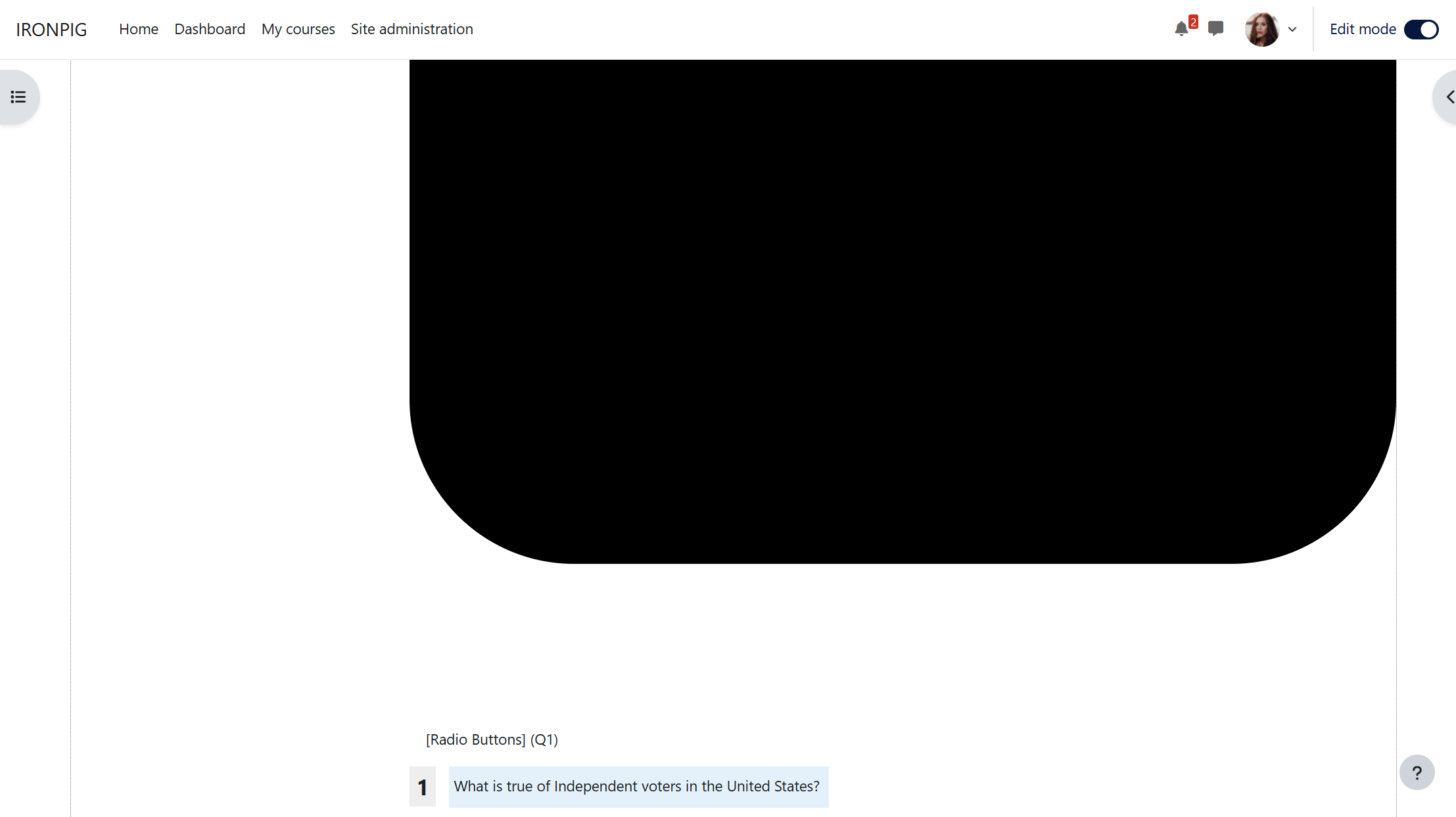
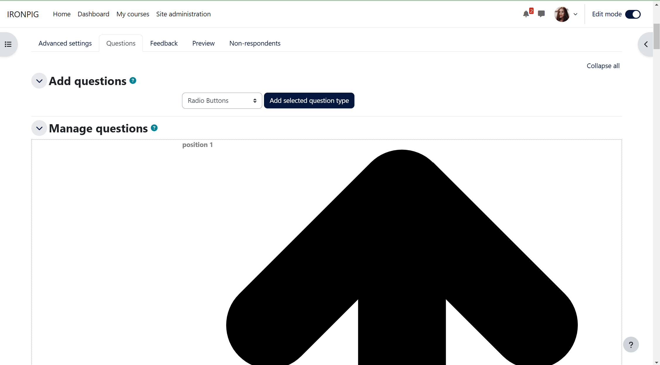
In the Questions tab under questionnaire, the icons to move, edit, delete and mark required icons take up way too much space. One icon is bigger than my entire screen. When editing the width in developer tools, my CSS changes affected the button sizes as well.
Please someone patch this so that the icons are smaller and on the same row as the "position" text.
P.S. The mark required icon used to be color coded (green = not required, red = required). Now, it is just black with square meaning required and right-pointing triangle meaning not required.